Samsung Electronics Co., Ltd. is a global leader in technology, electronics, and digital innovation. Based in Suwon, South Korea, and founded in 1969, the company is the flagship subsidiary of the Samsung Group and one of the world’s most influential manufacturers of consumer and industrial electronics. Over the decades, Samsung Electronics has become synonymous with quality, innovation, and technological leadership.
It is known for producing an extensive range of products, including smartphones, televisions, semiconductors, home appliances, and displays. The evolution of the Samsung Electronics logo is a saga of adaptability and reflects the growth of the company over the years. The article explores the various logo changes made by Samsung Electronics, among other details of the company.
The Genesis of the Samsung Electronics Logo (1969 – 1978)
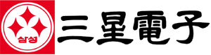
Samsung Electronics came into being in 1969, and the original logo featured a graphical emblem comprising three red stars symbolising the name of the company. The stars were placed inside a white circle with a red outline inside. These elements were encapsulated within a red square. To the right of the graphical emblem was placed the name of the company in Korean script and in a black colour palette.
(1978 – 1979)
The 1978 logo iteration saw the repeat of the previous graphical emblem but had the wordmark “SAMSUNG” in black uppercase written using a sans-serif typeface.

(1979 – 1980)
In the 1979 logo iteration, the wordmark “SAMSUNG” in black uppercase and written using a flat sans-serif typeface was placed to the right of an emblem. The emblem to the left comprised three white stars enclosed within three separate red hexagons placed one below the other, respectively. The middle hexagon was placed a little left in a stack comprising three hexagons in three levels.

(1980 – 1993)
In the 1980 logo variant, the shape of the hexagons was elongated, and the letters of the brand name in black, bold uppercase were a little elongated and spaced apart from each other.

(1993 – 2005)
The 1993 logo iteration was designed by Constance Birdsall for Lippincott & Margulies, and it featured the wordmarks “SAMSUNG” and “ELECTRONICS” at two levels and opposite ends (left and right), respectively. The wordmark “SAMSUNG” in white uppercase was executed using the Linotype Univers 820 Condensed typeface.
The typeface was characterised by the letter “A” without any horizontal bar. The wordmark was placed within an angled blue oval serving as the background. The wordmark “ELECTRONICS” in blue was written using a custom sans-serif typeface to the right and set against a white background.

(2005 – 2015) (2005 – Present) (Costa Rica, Nicaragua, and Panama)
The 2005 logo iteration retained the previous iteration, but without the “ELECTRONICS” wordmark.
(2013 – 2015) (Secondary), (2015 – 2020) (Primary)
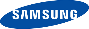
Designed by Brandstream, the logo first appeared at CES 2013 and depicted only the wordmark “SAMSUNG” in a custom Samsung blue colour palette. It was written using the Linotype Univers 820 Condensed typeface without any oval background.

(2013 – 2020) (Print), (2020 – Present) (General)
Samsung Electronics began to use its monochrome variant from January 2020 and was first displayed at CES 2020. Designed by Brandstream, it featured the wordmark “SAMSUNG” written in the Linotype Univers 820 Condensed typeface in modified black.

The Elements of the Samsung Electronics Logo
Font
The Samsung logo uses a custom sans-serif typeface, which is characterised by the following:
- Each letter is of the same height and spaced apart from each other for visual symmetry.
- The letter “A” does not have any horizontal bar.
Colour
The colour palette used to design the Samsung Electronics logo includes Samsung blue, black, and white. The Samsung blue colour symbolises innovation, trust, and technological precision. The colour black symbolises authority and sophistication, while white represents simplicity, purity, and openness.
Finally
The evolution of the Samsung logo shows the journey of the company from being a local player with deep cultural roots to a globally recognised leader in technology. The logo changes reflect changing priorities, that is, from tradition, through globalisation, to contemporary minimalism and adaptability. Each logo redesign shows the ambition of the company, the market shifts, and the unwavering commitment of the company to innovation and brand excellence.