Royal Enfield is one of the premier marquee motorcycle brands in the world with a rich history that dates back to 1901. Founded by entrepreneurs Bob Walker Smith and Albert Eadie in Redditch, England, the company went on to become known for durability, endurance, and precision. So, be it the rugged terrain of the Himalayas or the vast expanse of the highways in the hinterland, Royal Enfield has remained a faithful and dependable companion of countless drivers.
The Royal Enfield logo is a visual chronicle of one of the world’s oldest motorcycle brands. It reflects a journey from British industrial roots to Indian cultural icon. Its evolution shows the transformation, technological advancements, and enduring legacy of the brand. The article delves into the evolution of the Royal Enfield logo, among other details of the company.
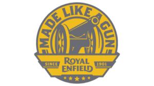
The Genesis of the Royal Enfield Logo (Old)
The original logo of Royal Enfield featured a roundel in mustard yellow with grey outlines and a wide ribbon at the bottom. At the centre of the roundel was placed a cannon in black with yellow contours to reflect the armament connection of the brand. Along the circumference of the roundel was mentioned the iconic slogan “MADE LIKE A GUN” in greyish colour in uppercase with sharp serifs and diagonal cuts. The wide ribbon at the bottom displayed the brand name in two levels and the date of establishment (1901). The bottom of the emblem had five stars of varying sizes to symbolise the premium quality of the motorcycles.
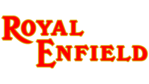
(1995 – 2014)
The 1995 logo came about with the taking over of Royal Enfield by Enfield India. As a result, the cannon motif and the multi-element emblem were removed. In its place appeared a simple wordmark depicting the brand name using decorative serifs. The serifs on the letters “A” and “Y” were horizontal, while they were pointed downwards in “F” and “E.” Further, the leg of “R” was extended to make it appear like a sharp blade-like shape. The thin golden outlines on a predominantly red-coloured wordmark created a sense of luxury and sophistication.
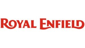
(2014 – Present)
The current logo in dark red was designed in 2014, and it retains a few features of its previous iteration. The brand name is rendered in a customised typeface with sharp and short serifs. Besides, the extended legs of “R,” “E,” and “D” with smooth curves that overlap with neighbouring glyphs add uniqueness to the logo.
The Elements of the Royal Enfield Logo
Font
The Royal Enfield logo employs a custom typeface with sharp and short serifs. The thickened letters of the wordmark offer the logo a visually embossed look. Further, the “R,” “E,” and “D” feature extended lines that overlap with neighbouring glyphs. The font used to write the wordmark is similar to Clear Gothic Pro Xbold by SoftMaker and Brothers Bold by Emigre.
Colour
The Royal Enfield logo has a colour palette comprising greyish shades of yellow, grey, and red. The colours evoke a sense of restrained love for motorcycles. Besides, the overall red colour of the logo represents the colour of adrenaline, energy, vitality, and movement.
Finally
The Royal Enfield logo is more than a trademark. It is a living symbol of heritage, craftsmanship, and resilience. From the cannon of its British arsenal days to the bold wordmark of today, each logo iteration honours the past and embraces the future. The logo is inarguably one of the most recognised and revered emblems in the motorcycle world.