Revlon, Inc. is an American multinational company specialising in cosmetics, skincare, perfume, and personal care products. It is based in New York City and has played a transformative role in the beauty industry for over nine decades. Over the decades, the Revlon logo has undergone various changes, which reflect shifts in design trends and the brand’s evolving identity. However, despite these changes, the logo has consistently embodied the brand’s values of sophistication, creativity, and professionalism. The article delves into the evolution of the Revlon logo and other company details over the years.
The Genesis of the Revlon Logo (1935 – 1938)
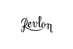
In its earliest years, Revlon did not have any official logo, and branding got its focus only around 1935, when the company introduced its first emblem. The initial logo featured the company name in a cursive, script-style font. The design was elegant, with connected lowercase letters and a sweeping uppercase “R” that underlined part of the word. This handwritten logo appeared in black and exuded a sense of luxury and femininity.
(1953 – 1965)
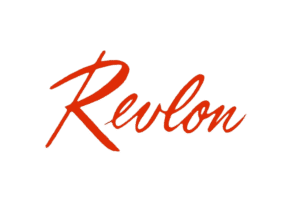
The 1953 logo variant brought a new typeface, which retained the cursive script but with letters that were closer together and slightly sharper. The wordmark leaned to the right to convey motion and energy and was typically displayed in bright red. The colour was used as it was synonymous with Revlon products and the passion of the beauty industry.
(1965 – 1977)
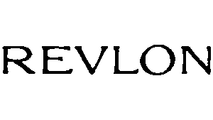
In the 1965 logo iteration, Revlon embraced a more minimalistic design. The script was replaced with bold, uppercase, block sans-serif letters. This new logo had a slightly textured appearance, which highlighted the creative edge of the brand while projecting strength and stability.
(1977 – 1989)
In 1977, Revlon introduced a logo that closely resembles the one recognised today. The uppercase letters in black became sharper and more refined and adopted a serif-style typeface for a sophisticated, professional look. A distinctive feature was the connection between the “L” and “O” at the baseline to symbolise unity and innovation.

(1989 – 2003)
The 1989 logo design was a refinement of the earlier logo, especially in its colour palette, which changed from black to scarlet red. Besides, the contours of the letters were refined, and the serifs were made to look distinct and professional.

(2003 – Present)
The most recent update came in 2003, when Revlon switched to a sleeker, more modern sans-serif typeface while retaining the connected “L” and “O”. This subtle change gave the logo a lighter, edgier, and more forward-thinking aesthetic, which aligned with contemporary design trends.

The Elements of the Revlon Logo
Font
The brand name appears in all uppercase letters, using a clean and modern sans-serif typeface characterised by precise lines and straight-cut letter ends. This custom font closely resembles WT Volkolak Sans Display or Acme Gothic Wide Light, lending the logo a sleek and contemporary feel while maintaining a strong visual identity.
Colour
The current Revlon logo is presented in two bold colour options—red and black—each symbolising passion, style, and professionalism.
Finally
Revlon’s logo evolution is a testament to the brand’s ability to balance tradition with modernity. The core elements of the logo have remained consistent, but subtle refinements have taken place over time. These ensured the brand stays relevant and appealing to new generations of consumers worldwide.