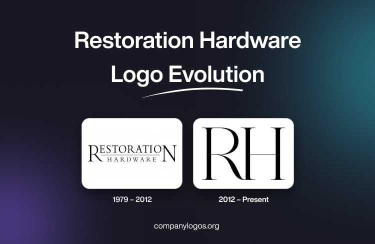
Restoration Hardware, or RH, is a US-based home furnishings company. It specialises in producing high-quality furniture, bathware, lighting, home decor items, and textiles. It is known for its upscale design and transforming or building luxury home environments. The logo of Restoration Hardware (RH) has undergone just one change since its founding in 1979. The change reflects the journey of the company from a vintage hardware store to a global luxury lifestyle brand. The article deals with the logo changes of the company and other details.
The Genesis of the Restoration Hardware Logo (1979 – 2012)
The original logo of Restoration Hardware was straightforward and functional. It featured the full name “Restoration Hardware” in two levels using a classic serif font in black and set against a white background. The first and last letters “R” and “N” of “Restoration” were designed bigger than the rest of the letters. They appeared to frame the whole logo as if it were an elegant scaffolding. Also, the two wordmarks were separated by a thin horizontal line. The bigger letters seem to offer the logo a harmonious look.

(2012 – Present)
A significant shift in branding took place under the leadership of CEO Gary Friedman. It was he who steered Restoration Hardware toward the luxury market. Consequently, the rebranding effort simplified the name to RH to reflect a more sophisticated and modern identity.
The new RH logo is minimalist and elegant and is rendered in thin, clean lines and a refined serif typeface. This design choice symbolises simplicity, sophistication, and exclusivity. Besides, it aligns with RH’s repositioning as a luxury lifestyle brand rather than a hardware retailer.
The thin lines and understated style of the logo convey the brand’s focus on high-end design and architectural aesthetics. These complement the company’s grand-scale design galleries and experiential retail spaces. These galleries, housed in architecturally iconic buildings, further blur the lines between retail, hospitality, and lifestyle. These make the logo a visual representation of this upscale evolution.

The Elements of the Restoration Hardware Logo
Font
The Restoration Hardware logo uses a stylish, luxurious, and impressive typeface that is similar to serif typefaces, namely, Cresci, Pontif, and Symphony Display Regular.
Colour
The Restoration Hardware logo uses black colour to achieve sophistication and a powerful brand image.
Finally
The evolution of the Restoration Hardware logo from a traditional, vintage-inspired wordmark to a sleek, minimalist “RH” emblem encapsulates the company’s journey. It showed how the company transformed from a niche hardware supplier to a global luxury brand. This transformation is reflected in the logo as well as in the brand’s retail experience, product offerings, and overall market positioning. Together, these make RH a distinctive name in luxury home furnishings today.