Reliance Jio, commonly known as Jio, is an Indian telecommunications company and a subsidiary of Reliance Industries Limited (RIL). It was commercially launched in 2016 and thereafter had transformed the country’s digital landscape. It offers affordable high-speed 4G services, free voice calls, and accessible data plans at an unprecedented scale. Its entry triggered a major shift in the telecom industry and accelerated India’s move toward widespread mobile internet adoption.
Beyond telecom services, Jio has also expanded into a comprehensive digital ecosystem that includes broadband (JioFiber), enterprise solutions, digital apps, cloud services, and emerging technologies. The article explores the various logo changes undertaken by Reliance Jio over the years, among other details.
The Genesis of the Reliance Jio Logo (2014 – 2016)
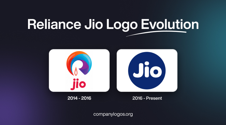
The original Reliance Jio logo featured a curved wave made of several colors with a gradient. The colors were orange, red, cyan, blue, and purple. A candle flame or a closed flower bud with a white core and pink edges appeared below between the letters “j” and “i.” Below the “wave” emblem, the wordmark “jio” in deep red lowercase letters was positioned.

(2016 – Present)
The 2006 logo rejig made it look simpler. It featured a solid blue circle with the word “Jio” inside in white. The ends of the glyphs of most letters were rounded.

The Elements of the Reliance Jio Logo
Font
The Jio wordmark in the logo is written in a title case, and the letterforms have smooth, rounded, and thickened lines.
Colour
The Reliance Jio logo uses a combination of a dark blue and white colours, where dark blue forms the circular background, while white forms the wordmark.
Finally
The Reliance Jio logo has changed only once till 2025, and it shows the journey of the company into becoming a transformative force in India’s digital revolution. Over the years, the logo has maintained its signature circular emblem that symbolizes unity and seamless digital integration.