Skip to content
Home » Famous logos » The History and Evolution of the Redmi Logo

The History and Evolution of the Redmi Logo

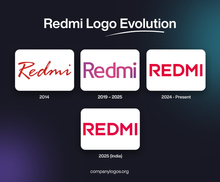
Redmi Logo Evolution

Redmi is a popular Chinese consumer electronics brand primarily known for its affordable smartphones that offer impressive features and performance. Originally, the brand was launched as a budget smartphone line by Xiaomi in 2013. It was in 2019 that Redmi became an independent sub-brand, which focused on delivering high-value devices to a global audience. In addition to smartphones, the Redmi product line also includes smart TVs, earbuds, power banks, and wearables.

The Redmi logo plays a key role in representing the brand’s identity. It embodies the brand’s mission to deliver cutting-edge technology at accessible prices. The article delves into the evolution of the Redmi logo, first as a sub-brand of Xiaomi and then as an independent entity, among other details.

The Genesis of the Redmi Logo (2014)

The initial logo was closely linked to Xiaomi, as it used similar typography and visual cues. The logo was released for the Xiaomi-owned Redmi 1S smartphone and was meant for the global market. The logo featured the “Redmi” name in lowercase cursive letters using a custom sans-serif typeface to emphasise its approachable and budget-friendly identity. However, this logo was short-lived and all Redmi devices featured the Mi logo till 2019, when Redmi became an independent sub-brand.

Redmi Logo (2014)

(2019 – 2025)

In 2019, Xiaomi formalised Redmi as an independent sub-brand. During this period, the Redmi logo made its way onto millions of devices worldwide. The wordmark forming the logo remained recognisable and retained the lowercase “Redmi” styling but in a combination of light pink with purple accents. Interestingly, the letter “m” had rounded bars, while the vertical bar of the letter “d” had a diagonal cut.

Redmi Logo (2019 - 2025)

(2024 – Present)

On November 15, 2024, Redmi underwent its most significant rebranding to date. The wordmark shifted from the lowercase “Redmi” to a more confident, bold, all-uppercase “REDMI” in scarlet red. This logo change reflected Redmi’s growing ambition and its evolution into a truly independent force in the smartphone market.

The rebranding debuted with the Redmi K80 series inside China and the Redmi A5 smartphone in the international markets. The logo change was carried out to integrate the visual identity across all Redmi devices. It evokes a more modern feel and seeks to differentiate Redmi from other Xiaomi products.

Redmi Logo (2024 - Present)

(2025) (India)

The 2024 all-caps logo was mainly confined to China. However, in August 2025, Xiaomi India unveils it in India alongside the launch of the Redmi 15 smartphone. Written in bold sans-serif letters, the all-caps “REDMI” logo is depicted in a bright red colour. It signifies the brand’s commitment to a new generation of users known for its resilience, clarity of thought, ambition, progress, and a desire to shape its future.

Redmi Logo (2025) (India)

The Elements of the Redmi Logo

Font

The logo uses a modern, sans-serif font, rendered in bold uppercase. The latest logo uses a clean and heavy typeface for impact and clarity. The all-caps design underscores Redmi’s ambition and independent identity.

Colour

The logo is exclusively in red to symbolise courage and confidence. Besides, it shows Redmi’s commitment to standing out in a competitive market.

The History of Redmi

Redmi was founded as a sub-brand of Xiaomi in July 2013. Initially, it targeted budget-conscious consumers in China with its first smartphone, the Redmi 1. The name “Redmi” derives from the Chinese word “Hongmi” (Red Rice), which symbolises affordability and accessibility. Besides, the name aligns with Xiaomi’s mission to disrupt technology markets with high-value offerings. In its early years, Redmi’s products were highly popular in China, thanks to attractive pricing, reliable performance, and the parent company’s strong online sales model.

Over the next several years, Redmi expanded its reach. The brand launched successive models such as the Redmi 2, Redmi 3, and Redmi Note series, which quickly gained traction in other Asian countries and India. Redmi’s strategy focused on delivering robust specifications, competitive prices, and the user-friendly MIUI operating system, which greatly fuelled its growth.

In January 2019, Xiaomi spun off Redmi into an independent sub-brand. This decision was made to distinguish Redmi’s focus on affordable and midrange devices from Xiaomi’s main lineup, which was focused towards more premium markets. Redmi’s debut as a standalone brand coincided with the launch of the Redmi Note 7. It introduced a new logo and branding strategy to signify greater autonomy and a broader international outlook.

Redmi rapidly grew beyond its budget roots by producing an increasingly diverse range of devices, which includes smartphones, smart TVs, and IoT products. The brand became synonymous with reliability and feature-rich products at accessible prices. These aspects helped it dominate mass-market segments in countries like India, Indonesia, and Russia.

During this period, Redmi continued to innovate by launching models with high-capacity batteries, improved cameras, and powerful chipsets. The Redmi Note series, in particular, became one of the world’s most popular product lines. It contributed significantly to Xiaomi’s global sales volume.

On November 15, 2024, Redmi underwent a bold rebranding exercise by changing its logo from lowercase “Redmi” to the striking all-caps “REDMI”. This move symbolised Redmi’s evolution from a value-centric sub-brand to an ambitious, standalone force in the smartphone sector. The rebranding launched with flagship devices like the Redmi K80 series and was progressively rolled out across all Redmi products.

Redmi’s new identity underscores its commitment to innovation and leadership. It aims to resonate with aspiring young consumers globally. The brand continues to maintain its reputation for offering high value and robust technology. With products that appeal to mainstream users as well as tech enthusiasts, Redmi is recognised for blending advanced features and affordability.

It is a formula that keeps the brand at the forefront of highly competitive markets. The roadmap of Redmi shows its greater expansion into global markets. Besides, it seeks to integrate deeply with Xiaomi’s ecosystem and focus on next-generation technologies such as AI, IoT, and 5G connectivity.

Interesting Facts About Redmi

  • Redmi was initially launched as a budget smartphone series by Xiaomi in 2013. However, it became an independent sub-brand in 2019, which focused on affordable yet powerful devices.
  • The name “Redmi” comes from the Chinese characters (Hóngmǐ), which translate to “Red Rice”.
  • The Redmi Note 7 series sold over 20 million units worldwide within just 7 months of launch in 2019.
  • Redmi has consistently been among the top-selling smartphone brands in India. It has often ruled the market in terms of shipments in the budget and mid-range segments.
  • Redmi is known for offering flagship-like features such as high-resolution cameras, large batteries, and fast processors at budget-friendly prices.
  • The Redmi Note 7 was one of the first budget smartphones to feature a 48MP camera. It revolutionised mobile photography in its price category.
  • Redmi also manufactures other electronics, such as smart TVs, power banks, earbuds (Redmi Buds), and fitness bands.
  • The Redmi K40 Gaming Edition is a performance-oriented phone equipped with gaming triggers and advanced cooling technology.
  • Redmi phones use MIUI, a customised Android-based interface developed by Xiaomi. It offers unique features such as dual apps, second space, and a customisable UI.
  • Redmi products are sold in over 70 countries, including India, China, Indonesia, Russia, and various European and Latin American nations.
  • Redmi has taken steps towards reducing plastic in its smartphone packaging, a step that aligns with Xiaomi’s sustainability goals.
  • Redmi has collaborated with popular celebrities like Ranveer Singh in India to reach wider audiences and enhance brand visibility.

Finally

The Redmi logo has transformed from a simple sub-brand tag to a bold symbol of independence and ambition. The logo changes reflect aesthetic decisions and deeper shifts in Redmi’s market position, user base, and aspirations for the future. The all-caps “REDMI” logo is now a visual representation of the brand’s evolution, that is, from a budget challenger to an aspirational market leader.

Leave a Reply

Your email address will not be published. Required fields are marked *