Ravensburger is a German company renowned for its puzzles, games, and books. It was founded in 1883 by Otto Maier in Ravensburg, Germany, as a book publisher. Its logo has undergone several transformations since its founding in 1883. These reflect the journey of the company toward becoming a household name globally. This article gives a detailed account of the history and evolution of the Ravensburger logo over the years.
The Genesis of the Ravensburger Logo (1883)
Ravensburger was founded by Otto Maier in 1883 in Ravensburg, Germany. During its initial years, the company did not have a unified logo. Instead, it used various trademarks for its products, including the initials “OM”, representing Otto Maier. The initial logo depicting the initials “OM” in monochrome had ornate designs both inside and on the periphery. At the centre of the logo appeared the twin pillars of a palace, which looked quite imposing. Also, the legs of the letter “M” were extended outside the letter “O” on both sides at the bottom. These had serifs to make the letter “M” display a stand-like element.
(1891)
The first logo change was a refinement of the previous logo in monochrome against a white background. It helped enhance visibility of the inside of the letter “O”. The rest of the logo elements, including the ornate castle pillars, remained the same.
(1892)
The 1892 logo iteration showed the stylish letter “M” placed inside a double-rimmed circle. The middle of the letter “M” in black had a knot, while the overall letter appeared in the foreground to the letter “O” in the background. Incidentally, the letter “O” with ornate designs looked more like a rhombus.
(1892)
In another logo iteration of 1892, the ornately designed “OM” in monochrome appeared in the middle of a circle with distinctive design elements at the periphery. The outer circle with its ornate designs, especially on the four sides, looked like an aesthetically curated mirror.
(1893)
In this logo iteration, the outer circle was removed, and the monogram created by the letters “OM” had shrub-like elements in monochrome. The twin legs of the letter “M” appeared like flower vines swaying to the right.
(1895)
In 1895, the monogram formed by the letters “OM” in thick monochrome was placed inside a heraldic shield with twin outlines. Further, the letter “M” in the middle had sharp and pointed serifs, while the shield had a few sharp ends as well.
(1895)
In another iteration of 1895, the shield outline was removed, and the monogram consisting of “OM” in monochrome was placed against a white background. The overlapping letters had black outlines and pointed serifs.
(1896)
The thick monogram in black with sharp serifs was placed inside a circle with thin and thick outlines. The letter “O” at the centre was stretched sideways to look like an oval.
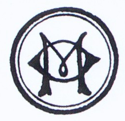
(1900)
In this logo iteration, the letter “M” in a thick, bold typeface with sharp serifs was placed inside the letter “O”. The outside circle was removed.
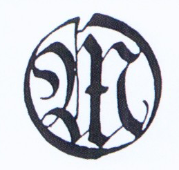
(1903)
In 1903, the logo comprised an emblem and a few wordmarks in two levels. The wordmarks depicted the abbreviated form of the founder’s name, while the vertically inclined oval-like emblem had a diffused ornate design within.
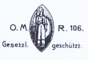
(1905)
In the 1905 iteration, the previous emblem was placed inside a solid black rhombus stretched horizontally. The name of the company in a geometric serif font in white was placed across the rhombus.
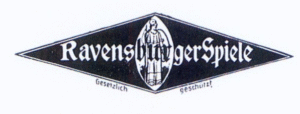
(1908)
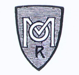
The OM monogram was changed in this iteration with the smaller letter “O” overlapping the middle of the bigger letter “M” in white with a black outline. The monogram is placed inside a shield with a grey background and a thick black outline. Also, just below the monogram was placed the letter “R” in black uppercase.
(1913)
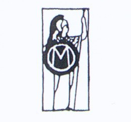
In the 1913 logo iteration, the “OM” monogram in white and set against a black background was placed inside a vertical rectangle with the image of a Roman soldier in the background.
(1913)
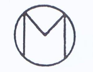
This logo iteration showed only the black outline of the “OM” monogram against a white background.
(1926)
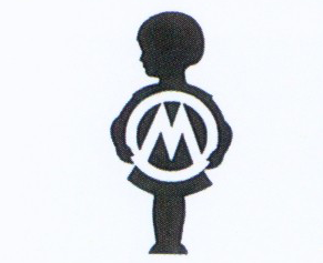
The 1926 logo iteration showed the “OM” monogram in white set against the black silhouette of a child.
(1936)
In this iteration, the letter “M” of the monogram is styled in the shape of two “S”. Also, the rounded ends of the letter are shown to be extended out of the letter “O”.
(1946)
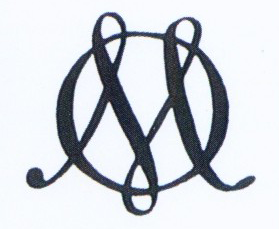
The 1946 design featured two pointed crests of the letter “M” in black protruding out of the letter “O” at the top. Also, the letter “M” is drawn using a combination of thin and thick lines. The bottom serifs of the letter are extended to the opposite ends at the bottom.
(1952)
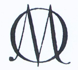
The “OM” monogram with thick outlines is set against a white background. Further, the letter “O” has fully circumscribed the letter “M” from all sides.
(1956)
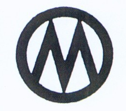
In 1956, the previous monogram, but in white, is placed against the silhouette of a girl-like figure.
(1957)
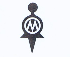
In 1957, the logo refined the previous design and placed its white variant inside an isosceles triangle. The base of the triangle in black had the name of the brand “Ravensburger Spiele” in white uppercase written across it.
(1957)
In another logo iteration of 1957, four variants of the previous logo design were placed inside a big rhombus. Divided into black and white segments, the rhombus featured the brand name in its white segments.
(1958)
This logo iteration showed the letters “O” and “M” in black placed over each other and divided by a thin black line.
(1958)
This logo variant is similar to the first 1957 variant with an isosceles triangle but features a different wordmark.
(1959)
The logo design of 1959 is the mirror image of the previous variant but with a different wordmark.
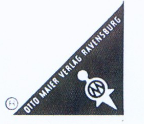
(1959)
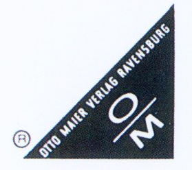
The previous logo variant was refined in 1959 to add the “O/M” monogram in white, instead of the girl-like figure.
(1963)
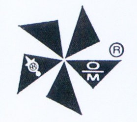
In this logo iteration, the twin emblems – a girl-like figure with the “OM” monogram and the “O/M” symbol – were placed inside a raft of five triangles in black. The triangles were placed to look like the blades of a fan.
(1966)
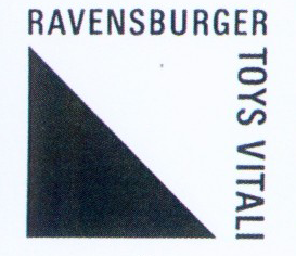
The 1966 logo variant featured a tilted triangle in black forming the half of a square. The remaining half in white had the wordmark “Ravensburger Toys Vitali” in black uppercase written at an angle to each other.
(1968)
The 1968 logo comprised 4 triangles forming a canopy. The upside-down triangle in the middle showed a girl-like figure in white with the “OM” monogram.
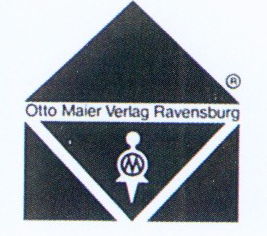
(1974)
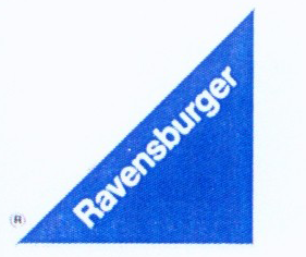
The logo iteration of 1974 was designed by Prof. Hans Köhler, an industrial designer. It features a blue isosceles triangle with the word “Ravensburger” placed in the lower right corner. The triangle shape symbolised clarity, stability, and harmony. The blue colour represented reliability, calmness, and safety—qualities that are valued by consumers. The image was placed in the bottom-right corner of the packaging to align with how consumers interact with products (e.g., grabbing game boxes or turning book pages).
Since adopting the blue triangle logo in 1974, Ravensburger has expanded globally. The logo is now featured on products sold across continents in over 100 countries. It has become synonymous with high-quality content that emphasises enjoyment, education, and togetherness. The blue triangle remains unchanged to this day and is considered one of the most successful trademarks in consumer surveys. It embodies Ravensburger’s values while serving as a visual guarantee of quality.
The Elements of the Ravensburger Logo
Font
The Ravensburger logo uses a clean, sans-serif font for the word “Ravensburger”. This font style emphasises simplicity, readability, and modernity and aligns with the brand’s focus on clarity and reliability. The letters in the wordmark are bold yet understated, which ensures they stand out without overwhelming the design. The font complements the geometric triangle shape to create a harmonious visual balance.
Colour
The logo prominently features the colour blue as its primary hue. The triangle is entirely shaded in blue, while the text “Ravensburger” appears in white within the triangle. These colour choices are deliberate, as blue symbolises trust, reliability, calmness, and safety—qualities that resonate with the brand’s target audience of families and children.
Blue is also widely regarded as a favourite colour in Germany, which enhances its appeal in the domestic market. On the other hand, white represents purity and simplicity, thus ensuring the text is highly legible against the blue background. The combination of blue and white creates a striking contrast that enhances visibility while evoking a sense of professionalism and dependability.
Finally
The various iterations of the Ravensburger logo—from Otto Maier’s initials to the iconic blue triangle—show the growth of the company from a regional publisher to a global leader in puzzles and games. The adoption of a unified logo in 1974 marked a turning point that established its identity and enhanced brand recognition worldwide. Today, the blue triangle stands as a symbol of trust and quality for families around the globe.