Qualcomm is a world-renowned US-based technology company known for revolutionising the world of wireless communication. It owns the 4G and 5G formats and is a leader in wireless chip technology. Established in 1985 by engineers Irwin Jacobs and Andrew Viterbi, the company can be said to be the veritable brain that drives most mobile devices of today.
The Qualcomm logo design conveys a sense of balance between creativity and engineering excellence. In fact, the history of the Qualcomm logo reflects the company’s evolution from its 1980s origins as a pioneering wireless technology firm to its position as a symbol of modern connectivity and innovation. The article delves into the evolution of the Qualcomm logo, among other details.
The Genesis of the Qualcomm Logo (1985 – 2018)
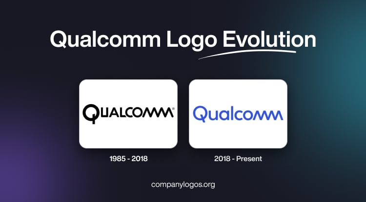
The original Qualcomm logo in monochrome colour featured the brand name in uppercase and in a custom geometric sans-serif typeface. The first letter, “Q,” was larger than the other letters, and the last two letters, “MM,” were depicted as a wave with rounded ends. The letter “Q” symbolises the power button on computers and other devices. The colour palette in white and black symbolises prestige, high status, and professionalism.

(2018 – Present)
The 2018 logo iteration was made more stylish and modern in collaboration with Interbrand. The colour black is replaced by vibrant blue to symbolise trust, dependability, and communication. The first letter, “Q,” has been changed to become more open and softer with rounded edges. The other glyphs have also been modified to match the wave-like letters “MM” at the end.

The Elements of the Qualcomm Logo
Font
The Qualcomm logo uses a modern sans-serif typeface to convey the characteristics of the field of telecommunications and wireless technologies. The letters display soft and smooth lines, and the presence of small spaces offers better readability.
Colour
The colour palette of the logo comprised light blue and white. Here, light blue is meant to convey reliability, trust, and responsibility, while the white background reflects honesty and integrity.
Finally
The Qualcomm logo, from its plain wordmark origins to its present dynamic swirling ‘Q,’ is more than just a visual signature. It stands as a beacon of technological progress, connectivity, and the relentless spirit of innovation that has defined the company for over four decades.