The famed Italian fashion brand Prada is known for its understated elegance and a modern approach to design. The company under the leadership of Miuccia Prada is known for an assortment of products, such as footwear, bags, clothing, accessories, and perfumes. Its classic bag models, namely, Cahier and Galleria, are known to be courted by fashionistas and fashion enthusiasts the world over.
The Prada logo is one of the most iconic symbols in luxury fashion and represents elegance, heritage, and innovation. Over its century-long history, the logo has undergone only a few changes. These reflect the evolution of the brand from a small leather goods shop to a global fashion powerhouse. The article delves into the logo designs of Prada over the years.
The Genesis of the Prada Logo (1919 – 2002)
Prada was founded in 1913 by Mario Prada in Milan as a boutique specialising in high-quality leather goods. The original logo was introduced in 1919 when Prada became the official supplier to the Italian royal family. This royal endorsement allowed Prada to incorporate heraldic elements from the House of Savoy into its logo. Thus, the logo contained the name of the company, the city of origin (Milano), and the year of establishment (1913) – all placed inside an ellipse formed by a rope. The upper section of the rope had the royal coat of arms and four nautical knots.

(2002 – Present)
The current Prada logo was introduced in 2002, and it features the brand name in black, bold, uppercase letters and written using a custom serif typography consisting of thin and thick strokes. Set against a white background, this logotype exudes elegance and simplicity. In the logotype the letters’ “A” depict sharp angles, while the letter “R” has a slight cut at the top of its leg.

Prada’s Triangle Logo
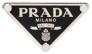
The inverted triangular emblem has always been intimately linked with Prada. This iconic triangle was first introduced in 1913 by the founder, Mario Prada himself. A symbol of luxury, quality, and craft, this mark features the brand name etched at the top in an uppercase, Engry font.

Beneath the name, the company’s birthplace, ‘Milano’, is mentioned in modern serif typeface. A regal ribbon is also present below it, which has the company’s year of origin engraved on it. Symbols of heraldry: a crown and a shield also appear in that narrowing triangular space.
The Elements of the Prada Logo
Symbol
The Prada emblem is a masterclass in simplicity and embodies the spirit of the iconic fashion label through its minimalist design. Unlike many fashion houses, Prada avoids overt displays of grandeur in its logo. It instead chose to let the name appear subtly on tags, buckles, small fasteners, and labels. This understated approach highlights Prada’s unique identity and its commitment to elegance without excess.
Font
A defining feature of the Prada logo is its distinctive font, which has remained unchanged since its inception in 1919. This bespoke typeface, characterised by bold uppercase letters with contrasting thick and thin strokes, has been a constant across all iterations of the logo.
Colour
Throughout its history, the Prada logo has predominantly used a basic black colour, which enhances its versatility across various settings. While black remains the standard, the logo occasionally appears in gold or white for specific contexts. The consistent use of these neutral tones reinforces the brand’s minimalist aesthetic and timeless appeal.
Finally
The Prada logo shows the journey of the brand from tradition to modernity while maintaining its core identity. Whether displayed on storefronts or subtly integrated into products, the logo continues to symbolise timeless sophistication and innovation in luxury fashion.