PewDiePie is the online alias of Felix Kjellberg, who has been a defining figure in digital entertainment since launching his YouTube channel in 2010. Over the years, his branding, which includes his iconic logos, has evolved in tandem with his content, audience, and personal growth. The article takes a closer look at the evolution of the PewDiePie logo over the years, among other details.
The Genesis of the PewDiePie Logo (2010 – 2013)
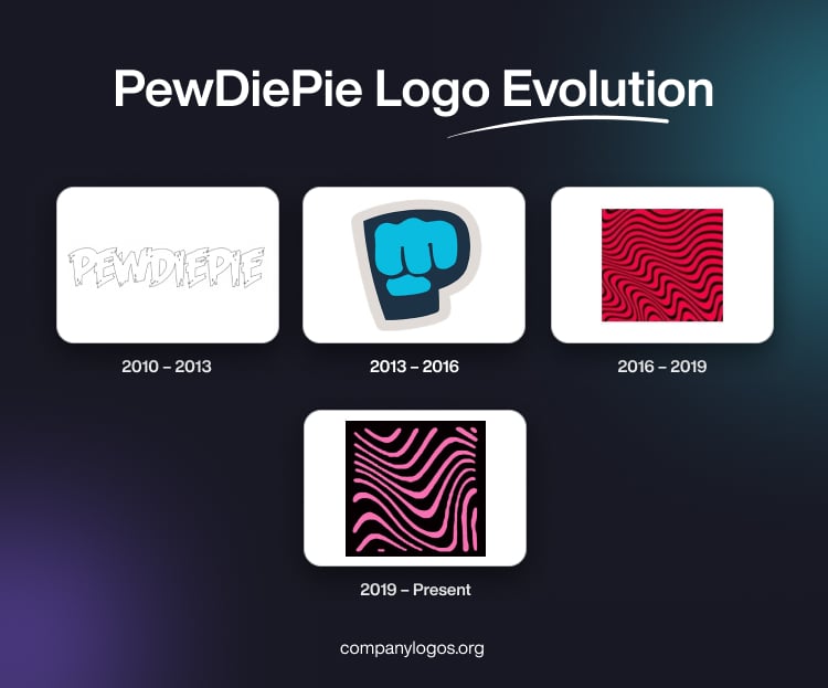
In the earliest phase of PewDiePie’s YouTube career, the channel’s logo was straightforward. It featured the word “PewDiePie” in white graffiti-like text with a grey outline. The white letters portrayed black stains, and the ends of the letters appeared torn. This way the lettering looked rebellious. This minimalist approach reflected the grassroots nature of his early content, which focused primarily on gaming commentaries and Let’s Plays, especially of horror games like Amnesia: The Dark Descent.

(2013 – 2016)
As PewDiePie’s subscriber count increased and his community, familiarly known as the “Bro Army,” grew, his logo underwent a transformation. From 2013, the channel adopted the now-famous “Brofist” icon with four fingers. It was a stylised light blue fist with a thick white outline and set within a bold letter “P.” This symbol quickly became synonymous with PewDiePie’s identity. It represented the connection between the creator and his fans through the “brofist” gesture. This era also coincided with the release of PewDiePie: Legend of the Brofist, a video game that further cemented the brofist as a central motif in his brand.

(2016 – 2019)
In 2016, PewDiePie unveiled a bold new logo, showing a red square filled with undulating black lines, which were often referred to as the “wave” or “wavy” pattern. This design marked a departure from the brofist imagery and instead opted for a more abstract and visually striking look. The pattern, which evokes a sense of movement and energy, became instantly recognisable.

(2019 – Present)
In the logo iteration of 2019, the designer opted for a psychedelic pattern. The undulating lines were redrawn with fewer elements, which made them look cleaner and minimalist. The black colour of the lines was switched with pink, while the red background was turned into black.

The Elements of the PewDiePie Logo
Font
The latest PewDiePie logo does not have any text, but the original one had a wordmark written using a customised, grotesque, and playful font.
Colour
The latest logo variant combines pink and black colours.
Finally
The PewDiePie logo and its iterations show the dynamic trajectory of Felix Kjellberg’s career, that is, from an independent gamer to a global internet phenomenon. Each logo variation encapsulates a chapter of his story, which resonates with millions and leaves a lasting imprint on the world of digital branding.