Panasonic Corporation is a global leader in electronics, technology, and innovation. Founded by the visionary entrepreneur Konosuke Matsushita in 1918 in Kadoma, Osaka, Japan, the company began with a small workshop producing lightbulb adapters. Initially, the company used to be known as Matsushita Electric Industrial Co., Ltd., and it adopted the unified name Panasonic in 2008. The company operates across diverse sectors, including consumer electronics, home appliances, automotive systems, energy solutions, industrial equipment, and smart technologies.
The Panasonic logo has evolved from humble beginnings as a mark for Matsushita Electric to one of the world’s most recognised minimalist wordmarks. It demonstrates the brand’s adaptability and enduring commitment to clarity and innovation. The article delves into the evolution of the Panasonic logo, among other details of the company.
The Genesis of the Panasonic Logo (1918 – 1955)
Panasonic’s origins go back to 1918 when Kōnosuke Matsushita founded Matsushita Electric. In the early years, the company branding featured the wordmark “Matsushita Electric” in formal, thin uppercase letters. This minimalist and functional logo focused on reliability and the industrial spirit.

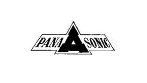
(1955 – 1965)
The “Panasonic” brand was officially introduced in 1955 for the export market. The monochrome logo comprising the “PANASONIC” logotype in uppercase was divided into two parts by a geometric emblem. The inward-tilted emblem featured a bold black triangle with arrow-like elements adorning each of its angles.
The emblem represented diversity, progress, and confidence. There was also a small white triangle in the middle of the large black emblem. The entire logo was surrounded by a thin black outline, which added to its elegance.
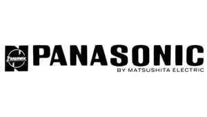
(1965 – 1968)
Between 1965 and 1968, Panasonic transitioned to a smoother, bold sans-serif typeface featuring the logotype “PANASONIC” in uppercase. It moved away from geometric motifs towards a modern, friendly aesthetic. A brief “By Matsushita Electric” tagline written below the brand name using a lightweight sans-serif typeface connected the brand to its roots.
The logotype was placed to the right of a monochrome emblem that consisted of a thin white circle with twin streaks at the top and bottom against a black background. The background resembled the letter “N”, and the foreground had a white “Panasonic” inscription at the centre.
(1968 – 1971)
In 1968, the logo became even more streamlined. It featured uppercase heavy black letters written using a modern sans-serif typeface with sharper angles to emphasise clarity and seriousness. However, this logo did not last long and underwent a change just three years hence.

(1971 – Present)
In 1971, Panasonic unveiled its most enduring logo, designed by Unimark International. It was a bold, minimalist wordmark in blue or black that utilised a customised Helvetica sans-serif font. This design emphasised scalability, neutrality, and legibility, qualities ideal for a global technology company. The logo’s enduring simplicity and professionalism have allowed it to remain largely unchanged for over five decades.

The Elements of the Panasonic Logo
Font
The wordmark in the Panasonic logo uses a customised version of Helvetica Black, which is a classic sans-serif typeface. The same has been chosen for its precise geometry, tight kerning, and universal appeal.
Colour
The Panasonic logo uses a combination of two colours – dark blue for the wordmark and white for the background. If dark blue conveys the ideas of consistency and a bright future, white conveys simplicity, purity, and clarity. Besides, white represents a clean and neutral background and allows the blue wordmark to stand out for maximum visibility.
Finally
The evolution of the Panasonic logo reflects the journey of the company from a small Japanese manufacturer to a globally recognised technology leader. Over the decades, the logo has adopted a clean, bold wordmark in a deep blue colour to symbolise trust, reliability, and innovation, as well as reinforce the brand’s global consistency. The Panasonic logo stands as a timeless emblem of quality and innovation. It carries forward the vision of Konosuke Matsushita to improve lives through technology.