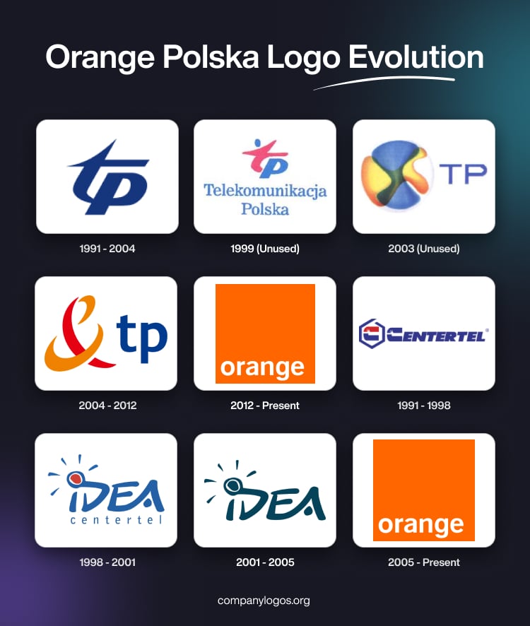
Orange Polska is one of the leading telecommunications providers in Poland. It boasts of a rich history that reflects the broader changes in the Polish telecom market. The roots of the company go back to 1991, when Telekomunikacja Polska (TP SA) was established as a state-owned entity.
For many years, the company operated under the TP brand, with a logo that reflected its Polish heritage and its role as the country’s primary fixed-line operator. However, in 2012, after years of coexisting as brands (TP for fixed-line, Orange for mobile), the company unified its identity. So, on April 16, 2012, Telekomunikacja Polska officially adopted the orange brand for all its products and services.
As a result, the TP logo was retired, and the orange logo became the sole visual identity for the company. The renamed Orange Polska logo can be classified into two categories, that is, for corporate brand and consumer brand. The article delves into both the logo categories and describes each iteration, among other details of the company.
The Genesis of the Orange Polska Logo (1991 – 2004)
Corporate Brand
Orange Polska used to be called Telekomunikacja Polska (TP SA) earlier, which gets reflected in its original logo. The logo featured the slightly slanted monogram comprising the interwoven letters “tp” in lowercase and in a deep blue colour palette. The letter “t” in the monogram had a pointed tip both at the top and on the left. Alongside the monogram appeared the italicised brand name in uppercase and rendered in a sans-serif typeface.


(1999) (Unused)
The 1999 logo iteration, though it remained unused, featured the original logo but with a few changes. For instance, the colour of the monogram was changed to a combination of red and blue, where “t” was represented in red and “p” in blue. The brand name in the title case was placed below in blue.

(2003) (Unused)
The 2003 logo comprised an abstract graphic to the left and the letters “TP” in blue uppercase to the right. The graphic appears in a splash of colours (orange, gradient yellow, gradient blue, and black).

(2004 – 2012)
The logo during this period showed the ampersand sign of France Telecom in red and orange to the left and the wordmark “tp” in lowercase blue to the right.

(2012 – Present)
The 2012 logo featured the famed Orange Polska logo with the wordmark “orange” in white written using a sans-serif Helvetica typeface and set against a rectangular orange background. The wordmark was placed at the bottom of the rectangular background.

Consumer Brand
(1991 – 1998)
Similar to the telecom brand, Orange Polska had a mobile division founded in 1991 operating under the Centertel brand. The initial logo of this mobile brand featured an emblem “C” enclosed within an open-ended hexagon in blue to the left, and the wordmark “Centertel” in blue uppercase to the right. The letter “C” of the emblem had its upper part coloured in red and the rest in blue.

(1998 – 2001)
In 1998, Centertel launched Idea, another GSM network, the logo of which featured the emblem containing a hand-painted wordmark “IDEA” in blue uppercase. The massive emblem had the letter “i” with a red dot at the top. Further, the red dot was surrounded by a blue outline and five small strokes in blue at a distance. Besides, the wordmark “centertel” in blue lowercase was written below in a smaller size with serifs.

(2001 – 2005)
In the 2001 logo variant, the above emblem was retained but without the text below. The hand-painted word “IDEA” forming the emblem had its red dot above the letter “i” changed to blue.

(2005 – Present)
In Poland, the orange brand first appeared in 2005 when it replaced the then-existing “Idea” mobile brand. The latest Orange Polska logo features a simple orange square with the word “orange” written in lowercase letters using the sans-serif Helvetica typeface in white. The logo is both minimalist and modern and evokes positivity and energy.

The Elements of the Orange Polska Logo
Font
The wordmark used in the Orange Polska logo is written using a sans-serif Helvetica typeface.
Colour
The Orange Polska logo employs orange as the predominant colour.
Finally
The Orange Polska logo and its various iterations show the transformation of the company from a national telecom operator to a modern, customer-focused brand with global reach. The logo has arguably become one of the most recognisable corporate symbols in Poland. It reflects both the legacy of Telekomunikacja Polska and the innovative spirit of the Orange Group.