Skip to content
Home » Famous logos » The History and Evolution of the Opera Logo

The History and Evolution of the Opera Logo

Opera Logo Evolution

Opera is arguably one of the most popular web browsers in the world. Founded in 1995, in Norway, the browser supports more than 130 languages and is used across the world by scores of people. The Opera logo has undergone several iterations and has evolved from a basic typographic mark to a bold, modern, and multidimensional symbol that reflects the brand’s growth and expanded vision. The article delves into the various logo changes by Opera, among other details of the company.

The Genesis of the Opera Logo (1994 – 1999)

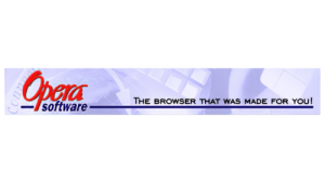
The first Opera logo was introduced in 1995, though it had been developing since 1994. It featured the wordmark “Opera” in red and handwritten in a bold cursive-style typeface. Beneath the wordmark appeared the word “software” in black, lowercase, bold, italics.

A long, thick black line preceded and followed the word “software” with the phrase “THE BROWSER THAT WAS MADE FOR YOU!” to the right and just above the line. The background for all the elements and wordmarks was a rectangle in light purple with off-white accents featuring drawings on a computer theme.

Opera Logo (1994 - 1999)

(1999 – 2001)

The 1999 logo iteration featured an emblem consisting of a large red “O” with soft outlines and a grey shadow at the back. These characteristics made the letter “O” look three-dimensional. The name of the company “Opera” in red uppercase was written beneath the emblem, while the word “software” in grey lowercase appeared below.

Opera Logo (1999 - 2001)

(2001 – 2003)

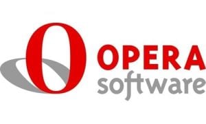
The 2001 logo saw the emblem become bigger and the grey shadow depicted in more or less the same proportion. The brand name and the secondary word “software” became a little bigger for better readability and featured to the right of the emblem. Also, the letters “f” and “t” in “software” were connected horizontally.

Opera Logo (2001 - 2003)

(2003 – 2009)

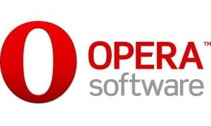
The 2003 logo variant is a three-dimensional one where the red colour of the emblem is made calmer, while the gradient tones have become intense. The grey shadow is depicted in a three-dimensional shape.

Opera Logo (2003 - 2009)

(2009 – 2013)

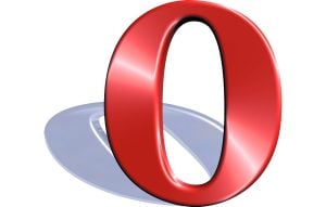
In 2009, the three-dimensional form of the emblem was retained, but the shadow was removed. Instead, the lower part of the letter “O” of the emblem was darkened. The company name and the additional “software” word were enlarged and rendered in a bolder sans-serif typeface. The colour red became more saturated, while grey got a lighter shade.

Opera Logo (2009 - 2013)

(2013 – 2015)

The 2013 logo saw further refinement with the emblem becoming thinner as well as elegant.

Opera Logo (2013 - 2015)

(2015 – Present)

In 2015, Opera unveiled a comprehensive rebrand to show its shift from a traditional software company to a broader internet service provider. So, the emblem “O” was transformed into a three-dimensional, ring-shaped form without any shadow. Besides, Opera dropped the “Software” portion from its name within the branding, which underlines its expansion beyond traditional software to digital experiences and services.

Opera Logo (2015 - Present)

The Elements of the Opera Logo

Font

The wordmark of the current Opera logo is rendered using a thin geometric sans-serif font. The similar fonts are Montreal Serial Light, BluHead Studio’s Churchward Legible Light, and others.

Colour

The 3D “O” emblem in the Opera logo is designed using the red gradient colour, while the wordmark is written using a monotonous black colour.

The History of Opera

Opera was founded in 1995 by Jon Stephenson von Tetzchner and Geir Ivarsoy. The concept originated from a research project at the Norwegian telecommunications company Telenor that aimed at developing a more efficient web browser. In 1995, it became an independent company, Opera Software ASA (now Opera Software AS), and released its first public version, Opera 2.0, for Windows in 1996.

In its early years, Opera gained a reputation for being lightweight, fast, and innovative. It introduced features such as a multi-document interface (MDI), a ‘hotlist’ sidebar for easy navigation, and strict adherence to W3C web standards. In 2000, the release of Opera 5.0 brought tabbed browsing to users. Also, for the first time, it offered the browser free of ads to increase accessibility. By 2005, with Opera 8.5, the ads were dropped entirely, and the company shifted to revenue from partnerships, most notably with Google.

Opera expanded beyond desktops into mobile platforms. It offered a version for Symbian in 2000 and later launched Opera Mini. The latter used compression technology to bring efficient web browsing to basic mobile devices, particularly in emerging markets. In 2013, Opera underwent a major technical transition, wherein it replaced its proprietary Presto engine with Chromium to improve performance and compatibility.

Three years later, in 2016, a Chinese consortium acquired Opera’s browser and consumer business. This enabled investment in new services such as a built-in VPN and a cryptocurrency wallet. Opera’s global ambitions were underlined in 2018 when Opera Ltd. became a publicly traded company on NASDAQ. In recent years, the company has launched new products such as Opera GX, which is a browser designed for gamers. It has continued to integrate AI-driven features while deepening its focus on privacy, cryptocurrency, and mobile technology.

Since its inception, Opera has introduced many innovations, which were later adopted as industry standards. These include tabbed browsing, Speed Dial, and integrated ad blocking. The brand embodies adaptability, technical leadership, and a commitment to reimagining the way users experience the web.

Interesting Facts About Opera

  • Opera was originally developed in 1995 by a Norwegian telecommunications company, Telenor. Later, it became an independent company called Opera Software.
  • Opera is among the few browsers from the 1990s that still exist today, alongside Internet Explorer’s successor (Edge) and Netscape’s descendant (Firefox).
  • Opera pioneered features that later became standard in other browsers, such as pop-up blocking, tabbed browsing, speed dial, and integrated search.
  • Opera Mini, which was launched in 2005, turned out to be revolutionary for mobile users in areas with slow internet. It used compression technology to reduce data usage by up to 90%.
  • Unlike most browsers, Opera comes with a free, built-in VPN and ad-blocker, which makes it appealing for privacy-focused users.
  • Until 2013, Opera used its own proprietary rendering engine called Presto. It later switched to Google’s Chromium engine for better compatibility with modern web standards.
  • Opera GX, introduced in 2019, is the world’s first gaming-focused browser. It comes with features like CPU/RAM limits, Twitch integration, and custom RGB themes.
  • Opera Software was acquired by a Chinese consortium led by Qihoo 360 and Kunlun Tech in 2016, but it continues to operate under the Opera brand.
  • Opera has integrated cryptocurrency wallets directly into its browser. It supports Ethereum and other blockchain-based platforms.
  • Opera has strong user bases in countries like India, Nigeria, and Indonesia. It is largely due to its lightweight mobile browsers and data-saving technologies.

Finally

The Opera logo and its various iterations show the company’s trajectory, that is, a shift from a niche Norwegian software startup to a global digital platform. The brand is expressed through a symbol that has gone from a text-based icon to a powerful, modern gateway. This adaptability ensures that Opera remains visually relevant and instantly identifiable as a brand that is committed to digital progress and to providing broad and inclusive access to the internet.

Leave a Reply

Your email address will not be published. Required fields are marked *