OKX is a leading global cryptocurrency exchange and a Web3 ecosystem that provides a wide range of digital asset services. These include spot and derivatives trading, decentralized finance (DeFi) tools, non-fungible tokens (NFTs), and a secure crypto wallet. The company was founded in 2017 and has since grown to become one of the most widely used platforms in the blockchain industry. It serves millions of users across more than 100 countries.
Known for its advanced trading features, deep liquidity, and robust security infrastructure, the exchange supports hundreds of cryptocurrencies. It offers innovative financial products such as futures, options, perpetual swaps, and staking. The OKX logo evolved in response to the company’s strategic growth and vision. The logo reflects the transformation of the company from a crypto exchange into a global leader in blockchain technology and decentralized finance. The article delves into the evolution of the OKX logo, among other details of the company.
The Genesis of the OKX Logo (2017 – 2022)
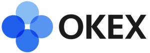
In 2017, as Okcoin branched out from basic trading to advanced crypto services, the company introduced the OKEX brand. The first OKEX logo used a clean sans-serif wordmark in black uppercase paired with a graphical emblem to the left. It consisted of four overlapping circles in various shades of blue representing digital “exchange” and interconnected blockchain nodes. The “EX” emphasized the exchange aspect.
(2022 – Present)
In January 2022, OKEX rebranded as OKX to mark its shift from an exchange-focused platform to a wider suite of blockchain-based products and decentralized services. The new brand dropped the “EX” part to reflect a departure from being only an exchange. It aimed to embrace a broader identity for the Web3 era.
The current OKX logo features a bold, geometric wordmark built upon a custom font. Each letter (“O,” “K,” and “X”) is constructed from a matrix of black rectangles or squares to create a modular, tile-like appearance. The design alludes to blockchain building blocks, digital grids, and transparent technology infrastructure. The colour palette of the current OKX logo is starkly minimal and comprises pure black on a white or transparent background.

The Elements of the OKX Logo
Font
The OKX logo uses a custom geometric sans-serif font that gives it a bold, clean, and futuristic appearance. Its block-style lettering conveys stability and trust, while the sharp edges and uniform design suggest precision and cutting-edge technology.
Colour
The colour palette of the OKX logo consists of black and white to emphasise simplicity, neutrality, and versatility. Here, the black colour represents strength, authority, and professionalism, while the white background adds clarity and balance.
Finally
The evolution of the OKX logo shows the transformation of the company from a centralized crypto exchange to a trailblazing ecosystem embracing decentralized technology. Dropping the “EX” from its former OKEX identity was a key move that symbolized a shift beyond conventional exchange services.
It captured OKX’s expanded focus on blockchain innovation, DeFi, NFTs, and comprehensive financial solutions. The new logo of modular, grid-inspired design reflects the compositional strength and scalability of blockchain. It also signals OKX’s commitment to transparency and accessibility in the Web3 era.