Nvidia is a world-renowned US-based company that makes high-performance GPUs and chipsets. Founded in 1993 in Santa Clara, the company is behind products that are used to drive cars, gaming consoles, computers, and other systems. Besides being a global powerhouse in graphics processing and artificial intelligence, Nvidia has maintained one of the most distinctive and enduring logos in the tech industry. The journey of its visual identity reflects both the company’s vision and its transformation from a niche graphics startup to a dominant force in AI and computing. The article explores the journey of the Nvidia logo, among other details of the company.
The Genesis of the Nvidia Logo (1993 – 2006)
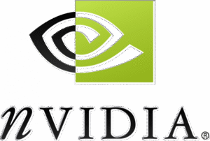
The original Nvidia logo featured the now-iconic “all-seeing eye” since the inception of the company. The original design was a split-eye motif, that is, one half black and white and the other half white with a green square above it. This was paired with a wordmark below in a classical serif typeface in black with silver-grey shadows.
The wordmark “nVIDIA” had a uniquely italicised lowercase “n”. The green and black colour scheme was chosen to symbolise originality, growth, and the company’s relentless pursuit of innovation. The eye itself was a metaphor for vision and forward-thinking. Besides, it aligned with Nvidia’s mission to push the boundaries of computer graphics and technology.
(2006 – Present)
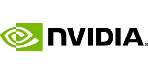
In 2006, Nvidia undertook a significant brand refresh. The eye symbol of the logo was refined, wherein the black half was replaced with green, and the green square became a darker and more saturated shade. The wordmark shed its serif font and italicised “n” in favour of a bold, uppercase Nvidia sans typeface. It represented strength, modernity, and confidence. This update aligned Nvidia’s visual identity with the sleek aesthetics of the digital age. It also supported its growing influence in gaming, professional visualisation, and high-performance computing.
The Elements of the Nvidia Logo
Font
The wordmark shown in the Nvidia logo uses a customised uppercase sans-serif typeface. The corporate logo used a modified Handel Gothic typeface till 2022 and Nvidia Sans from thereon.
Colour
The Nvidia logo uses a green and blue colour to show its emblem and wordmark, respectively.
Finally
The Nvidia logo has evolved in subtle but meaningful ways. However, it has always retained its core symbolism of vision, innovation, and leadership. The enduring “all-seeing eye” has become a beacon for the company’s relentless drive to shape the future of technology. The logo has thus become one of the most recognisable and respected marks in the industry.