The NTT Group, aka Nippon Telegraph and Telephone Corporation, is one of the top information and communication companies in the world. Founded on August 1, 1952, by the Government of Japan, the company provides a wide range of services. These include mobile communications, telephone and data services, and internet services.
The history and evolution of the NTT logo reflect the modernisation of Japan’s telecommunications as well as the identity of the company as an innovator in technology and service. The iconic “Dynamic Loop”, which was first introduced in 1985, has become one of the most recognised corporate symbols in Japan. The article explores the evolution of the NTT logo over the years, among other details.
The Genesis of the NTT Logo (1952 – 1985)
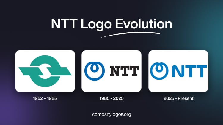
The original NTT logo featured two interconnected “T” letters with thick horizontal bars enclosed in a loop to symbolise connectivity and national communication infrastructure. This minimalist emblem is designed in a turquoise green and white colour combination. The logo depicted the purpose of the company of uniting people worldwide through the connections of telegraph and telephone.

(1985 – 2025)
In 1985, NTT was spun off as a private company following a major reform and privatisation initiative. To mark the occasion an initiative was taken to build a comprehensive corporate identity. It sought to break with the past and position NTT as a forward-looking, customer-friendly organisation.
The famed dynamic loop logo was designed by Yūsaku Kamekura, in collaboration with PAOS (under Motoo Nakanishi). The designer explored over 150 concepts before settling on a form that was “simple and impressive”. Besides, it suggested the futuristic qualities of optical fibre. The dynamic loop emblem in blue consists of a bold, single curved line forming a spiral with a small loop at the top.
It expressed technological dynamism and the aspiration of the company to continually listen to customers and society. The brand name to the right of the emblem was written in black using the Lubalin Graph typography with thick pronounced serifs.
(2025 – Present)
To align with its increasingly global business and to mark its 40th anniversary as a private company, NTT refined its logo in 2025. It retained the iconic Dynamic Loop emblem but changed the typeface of the brand name “NTT” into a rounded custom designed one based on the NTT Data logo. The colour of the brand name was standardised from black to blue to symbolise unity and advanced technical capability.

The Elements of the NTT Logo
Font
The uppercase wordmark that forms a part of the NTT logo is rendered using a modern custom-designed geometric serif typeface. The typeface has similarities with Mortise X-Bold, Fantabular MVB Bold, and Sutro Shaded Fill.
Colour
The colour palette of the NTT logo is a combination of blue and white. Here, blue conveys trustworthiness and safety and aligns with the values of the company.
The History of NTT
The foundation of NTT, or Nippon Telegraph and Telephone Corporation, was laid on August 1, 1952, under the Nippon Telegraph and Telephone Public Corporation Act. This state-owned entity was tasked with building and managing a nationwide telephone network and, in the process, eliminating telephone waiting lists and ensuring 100% automatic connection availability across Japan. During Japan’s postwar economic recovery, NTT aggressively expanded the telephone infrastructure and helped grow the user base significantly. So, by 1972, telephone subscribers had reached 20 million, and by 1977, telephone services were made available nationwide.
In the 1960s and 1970s, the corporation expanded into data communications (from 1968 onwards) and developed new telecommunications technologies. This contributed significantly to Japan’s microchip and telecommunications industries. NTT showcased futuristic technologies such as videophones and wireless telephones in public exhibitions to reflect its vision for advanced communications technology.
A major turning point came in 1985 when Nippon Telegraph and Telephone Public Corporation was privatised to become Nippon Telegraph and Telephone Corporation (NTT). This shift was made to increase competition and innovation in the telecom sector of Japan. This shift made Japan one of the first countries to deregulate telecom markets. NTT quickly became a publicly traded company in 1987 with a landmark stock offering.
Further, to optimise operations, NTT was reorganised into a holding company with three primary subsidiaries—NTT East, NTT West, and NTT Communications. This addressed local and long-distance communications with regulated roles. The structural change that came about helped foster more competition and innovation while maintaining network reliability across Japan.
NTT expanded its portfolio with the creation of NTT DATA in 1988 to focus on information technology and system integration services. In 1992, NTT Mobile Communications Network (now NTT DOCOMO) began operations and quickly became a flagship mobile communications provider. NTT DOCOMO played a significant role in the development of mobile internet with pioneering services like i-mode launched in 1999.
In the 2010s, NTT expanded globally by acquiring international IT firms like Dimension Data. This acquisition significantly enhanced its network capacity, especially in transpacific communications. The company also focused on sustainability by issuing green bonds to fund environmentally friendly projects.
NTT has played a foundational and transformative role in Japan’s telecommunications history. It evolved from a government monopoly to a diversified, globally influential technology powerhouse. NTT continues to adapt to the changing landscapes of communication and digital innovation.
Interesting Facts About NTT
- NTT is among the largest telecommunications companies globally and has consistently ranked in the Fortune Global 500.
- NTT was established in 1952 as a government-owned corporation in Japan before being privatised in 1985.
- Through subsidiaries like NTT Ltd and NTT Data, the company operates in more than 80 countries and serves both businesses and governments worldwide.
- A major subsidiary of NTT, NTT Data is a top global IT services provider. It offers consulting, system integration, and digital transformation solutions.
- NTT has played a key role in the development of optical fibre technology, which is essential for high-speed internet and communication.
- NTT is known for cutting-edge research in areas like 6G, artificial intelligence, quantum computing, and cybersecurity.
- Its mobile communications arm, NTT Docomo, is one of the largest mobile carriers in Japan and has been influential in advancing 3G, 4G, and 5G technologies.
- NTT is actively involved in smart city and digital infrastructure projects across the world by integrating IoT, AI, and data platforms.
- NTT sponsors several sporting events and teams, including rugby, cycling, and motorsports.
- NTT has committed to achieving net-zero emissions by 2040 by working towards green energy, efficient data centres, and sustainable ICT solutions.
Finally
The evolution of the NTT logo is a rare example of strong visual continuity. It also showcases symbolic design and adaptive application. The logo iterations echo the transformation of the company from a state monopoly to a global leader in communications technology.