Nokia Siemens Networks (NSN) was a major global telecommunications equipment and services company. It was formed in 2007 as a joint venture between Nokia’s Networks business group and Siemens’ Communications division. The company was created to strengthen the competitive position of both parent companies in the rapidly evolving telecom industry. In fact, soon after its establishment, NSN became a key player in providing infrastructure, technologies, and managed services. It enabled mobile and fixed network operators to build and operate next-generation communication networks.
The company played a key role in advancing broadband, 3G, and later 4G LTE technologies. It helped shape the modern telecommunications landscape and set the foundation for future developments in digital connectivity. The article delves into the evolution of the Nokia Siemens Networks logo, among other details, of the company. It shows the transformation of the company from a 50-50 joint venture into a wholly owned subsidiary of Nokia.
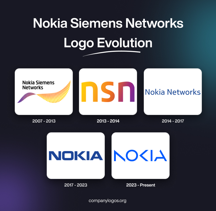
The Genesis of the Nokia Siemens Networks Logo (2007 – 2013)
Nokia Siemens Networks was a joint venture launched in 2007, and its logo combined the logos of both parent companies. The new logo featured a graphical emblem in yellow and purple that looks like a “wave” or an abstract symbol with a gradient, and the wordmark “Nokia Siemens Networks” in a black title case. The wordmark written in two levels was in a custom, clean, and modern sans-serif typeface.

(2013 – 2014)
On 7th August 2013, Nokia acquired the stake held by Siemens in Nokia Siemens Networks and ended the joint-venture arrangement. Thus, from 2013 onwards, Nokia Siemens Networks became a wholly-owned subsidiary of Nokia. The resultant change in logo saw the name “Siemens” being phased out and the abbreviation “nsn” in lowercase representing the rebranded entity Nokia Solutions and Networks. The abbreviation “nsn” depicted shades of yellow, pink, and purple with a gradient.

(2014 – 2017)
On 29th April 2014, the company rebranded itself to Nokia Networks, which necessitated a logo change. The resultant logo featured the wordmark “Nokia Networks” in blue and used a thin sans-serif typeface in a title case.

(2017 – 2023)
In 2017, as part of the global brand unification strategy, the logo of Nokia Networks featured the wordmark “NOKIA” in a dark blue, sans-serif typeface. The letter “O” in the wordmark resembled a rectangle with rounded corners instead of the oval or circle. Also, the letter “K” resembled an arrowhead.

(2023 – Present)
The current logo of Nokia Networks shows the stylised logotype “NOKIA” in a lighter shade of blue. The wordmark has vertical bars of some of the letters “N”, “K” and “A” absent. The logo reflects the company’s portfolio offering network infrastructure, mobile networks, and other telecommunications equipment and services.

The Elements of the Nokia Siemens Networks or NSN Logo
Font
The wordmark used in the erstwhile Nokia Siemens Networks logo (now defunct) featured a clean, custom-designed, and modern sans-serif typeface to convey a sense of modernity, cohesion, and neutrality. The sans-serif typeface looked professional, technological, and contemporary.
Colour
The gradient wave symbol used in the Nokia Siemens Networks logo featured the blending of yellow and purple to convey a dynamic, modern, and energetic feel.
Finally
The evolution of the Nokia Siemens Networks logo tells a story of transformation. It shows how the company came about as a joint venture between two major players in telecommunications and later became a unified part of Nokia’s global network business. So, each logo change, from “Nokia Siemens Networks” to “Nokia Solutions and Networks” to “Nokia Networks”, reflects legal and ownership changes as well as a strategic effort to streamline identity. The logo evolution also shows how Nokia built brand clarity and reinforced continuity under its overarched name.