Noise is a leading Indian consumer tech company that specialises in smart wearables, audio devices, and connected technologies. Based in Gurgaon, Haryana, the company was founded in 2014 by Amit and Gaurav Khatri. Initially, Noise began as a phone cover business before rapidly evolving into one of the world’s top smartwatch manufacturers. The company has built its brand around affordable, feature-rich products designed specifically for Indian consumers.
The Noise logo has evolved since the company’s inception, and it reflects the brand’s growth from a startup selling mobile accessories into one of India’s leading wearable technology companies. The Noise logo is closely tied to the ambition of the company to connect with tech-savvy youth and project a dynamic, modern brand identity. The article delves into the Noise logo, among other details of the company.
The Genesis of the Noise Logo (201? – 2020)
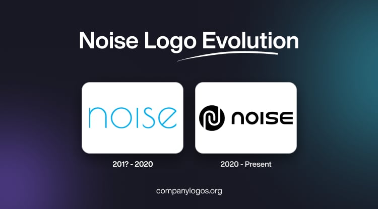
The design of the original Noise logo was minimal and centred around clear, modern sans-serif typography that resonated with the accessible and user-friendly ethos of the brand. The logotype featured the brand name in lowercase, characterised by thin rounded letters and clean lines in light blue. One of the highlights of the logotype is the diagonal bar of the letter “e”.

(2020 – Present)
The current Noise logo combines a graphical emblem and the brand name in monochrome. The logo possesses a more contemporary and modern look and reflects the evolution of the brand and its products in a better way. The emblem features a black circle containing two interconnected spirals in white. To the right appears the brand name in black and written in a mix of lowercase and uppercase letters using a rounded, geometric, crisp, and modern sans-serif typeface.

The Elements of the Noise Logo
Font
The Noise logo features a rounded, geometric, crisp, modern sans-serif font to improve legibility and stand out across digital and physical platforms.
Colour
Noise adopted a high-contrast colour scheme of black and white, which makes its branding more eye-catching and instantly recognisable.
Finally
The evolution of the Noise logo illustrates the brand’s journey from a startup to a technology leader. Noise’s commitment to innovation and relevance continues to drive updates to its visual identity and ensures it remains instantly recognisable and meaningful to its community.