Skip to content
Home » Famous logos » The History and Evolution of the NHK Logo

The History and Evolution of the NHK Logo

NHK Logo Evolution

NHK, or Nippon Hoso Kyokai, is the national broadcasting corporation of Japan and was founded by the Government of Japan on November 29, 1924. Based in Shibuya, Tokyo, NHK offers a plethora of radio, television, and online services. The programmes broadcast by multiple radio and TV stations owned by NHK include entertainment, news, culture, and educational programmes.

Over the years, the NHK logo has undergone a series of changes. These reflect the establishment of the organisation and its evolution as a public media institution. The article delves into the various logo changes undertaken by NHK, among other details.

The Genesis of the NHK Logo (1925 – 1926)

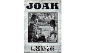
The original name of NHK was JOAK Radio, and its logo looked more like a poster in black and white. It featured a Japanese lady sitting by the side of a speaker with a wordmark in English above and in Japanese below. Thereafter in the same year, radio stations were opened in Osaka (JOBK) and Nagoya (JOCK).

NHK Logo (1925 – 1926)

(1926 – 1950)

In August 1926, the three radio stations in Tokyo, Nagoya, and Osaka merged to form NHK. However, the official name of the organisation before and during the Second World War was the Broadcasting Corporation of Japan. The logo of the period featured the brand name in Japanese enclosed within several concentric circles that were broken in places to form a pattern.

NHK Logo (1926 – 1950)

(1950 – 1962)

The 1950 logo iteration followed from the idea of using “the big three” of American broadcasters and the BBC, as laid down by the Civil Information and Education Section of the Allied Powers. Accordingly, “NHK” in black and rendered in a bold sans-serif typeface was constituted as an identifier of the organisation.

NHK Logo (1505 – 1962)

(1953 – 1962)

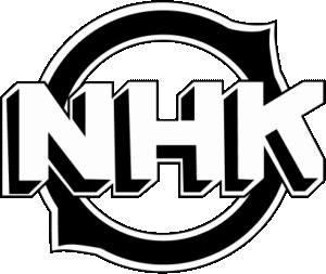
The 1953 logo iteration saw the abbreviation “NHK” written in white with black shadows and outlines to give a three-dimensional image. It was placed against a ring-like circular background in black with white outlines and two pointed bulges.

NHK Logo (1953 – 1962)

(1962 – 1995)

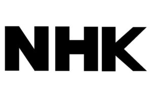
In May 1962, NHK officially standardised its logo as a wordmark, which was used consistently for over three decades. It showed the “NHK” wordmark in an italicised and bold sans-serif typeface in uppercase. The letters of the wordmark had spaces between them. This logo was typically superimposed on programme openings and closings. It helped establish a recognisable visual presence for the broadcaster.

NHK Logo (1962 – 1995)

(1967) (Unused)

Designed by Yusaku Kamekura, the 1967 logo iteration featured the elongated wordmark in a thick, bold, and black serif typeface. The middle of the abbreviated wordmark displayed the letter “I” cut into two equal parts.

NHK Logo (1967) (Unused)

(1973) (Unused)

The 1973 logo variant was designed by Rei Yoshimura, and it featured the wordmark written in the Univers typeface. To the left of the wordmark was an emblem consisting of 9 solid circles, where every set of 3 circles had separate colours. The red, blue, and green colours represented the primary colours of television. The solid circles represented the phosphor dots of colour television screens.

NHK Logo (1973) (Unused)

(1995 – 2020)

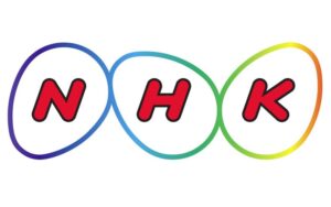
In 1995, to mark its 70th anniversary, NHK introduced a new logo designed by the Nippon Design Centre. This design featured three interlocked ovals (commonly referred to as “eggs”), where each contained a letter of “NHK.” The ovals symbolised new life, infinite possibilities, and a society of mutual support. The design also referenced the creativity of Columbus’s egg to underscore the commitment of NHK to innovation and knowledge dissemination.

The three ovals also represented three key concepts, such as pleasant living, new life and unlimited possibilities, and a cooperative society. The logo was intended to embody NHK’s vision for public broadcasting in a rapidly globalising and diversifying world.

NHK Logo (1995 - 2020)

(2020 – Present)

In May 2020, NHK updated its logo by removing the three ovals and retaining only the “NHK” inscription. It was displayed in a light grey colour and written in a bold, italic, and rounded sans-serif typeface. This move reflected a trend toward minimalism and digital adaptability. It made the logo more versatile for modern media platforms.

NHK Logo (2020 - Present)

(2025) (100th Anniversary Logo)

To celebrate NHK’s 100th anniversary in 2025, a special commemorative logo was introduced. This design uses NHK’s signature grey wordmark in italics and incorporates the three primary colours of television screens, that is, red, green, and blue. Each colour represents a different aspect of NHK’s programming. For instance, red for entertainment (joy and creativity), green for education and welfare (care and growth), and blue for news (accuracy and credibility).

NHK Logo (2025) (100th Anniversary Logo)

The Elements of the NHK Logo

Font

The wordmark used in the NHK logo is rendered using a bold, italicised, and rounded sans-serif typeface. The smooth lettering reflects confidence and progress.

Colour 

The NHK logo employs a light grey colour, and the monochrome variants are based on the background and requirement.

The History of NHK

NHK (Nippon Hōsō Kyōkai) is the national public broadcasting organisation of Japan with a rich history that reflects the development of Japanese media and society. The origins of this organisation date back to the Tokyo Broadcasting Station, which aired the first radio transmission in Japan on March 22, 1925. The organisation was established under the leadership of Count Gotō Shinpei and was licensed by the Ministry of Posts and Telecommunications. It soon merged with others in Osaka and Nagoya in August 1926 to form Nippon Hōsō Kyōkai (NHK). Thus, the newly formed NHP was modelled after the BBC in the UK.

NHK quickly became an essential communication tool and started broadcasting major national events such as the enthronement of Emperor Hirohito in 1928. By 1930, NHK had established its own research laboratory and, in 1931, launched a second radio network. In 1935, it began international broadcasts under the name Radio Tokyo. However, during the 1930s and the Second World War, NHK was used as a propaganda outlet for the militaristic government of Japan.

After the Second World War, the 1950 Broadcast Law dissolved the original NHK. However, it was re-established as a new public broadcasting corporation and forbade government intervention in programming. It also allowed private broadcasters to enter the market. NHK launched television broadcasting on February 1, 1953, and led the medium in Japan despite the limited number of TV sets at the time.

In 1959, NHK introduced its Educational TV channel, thereby expanding its role in cultural and educational programming. And with the introduction of colour television in 1960 and the ushering of nationwide colour broadcasts by 1966, NHK created several milestones.

In the decades that followed, NHK expanded its operations to include multiple terrestrial and satellite TV channels. These included NHK General TV, NHK Educational TV, and international services like NHK World-Japan. It also operates three national radio networks and an international shortwave service. NHK has been at the forefront of broadcast technology, such as pioneering high-definition (Hi-Vision) and 8K television standards.

The organisation is funded by receiving fees paid by all households with a TV, which ensures its independence from commercial advertising. Its governance structure includes a board of governors appointed by the prime minister. This arrangement has sparked debates about editorial independence, especially amid political pressures.

NHK is renowned for its news coverage, educational content, historical dramas, and cultural programming. Its flagship 7:00 pm newscast has become the staple of Japanese media. The broadcaster has played a crucial role in shaping Japan’s media landscape. Besides, it has promoted cultural exchange and supported educational initiatives nationwide.

NHK stands as a symbol of Japanese public service broadcasting. It deftly balances innovation, cultural preservation, and public accountability as it continues to adapt to the digital age

Interesting Facts About NHK

  • NHK began its journey with Japan’s first radio broadcast on March 22, 1925. It did so from a makeshift studio set up in the library of the Tokyo Higher School of Arts and Technology. To keep the equipment cool, it used large blocks of ice since there was no air conditioning at the time.
  • The broadcaster was originally formed in 1926 by merging radio stations in Tokyo, Osaka, and Nagoya. It was modelled after the BBC and became a nationwide network with 27 stations within a decade.
  • During the 1930s and the Second World War, NHK was used as a propaganda tool by the government of Japan. It also broadcast the famous Gyokuon-hōsō, the surrender speech of Emperor Hirohito, in 1945.
  • NHK was re-established as an independent public corporation in 1950 under a new broadcast law that forbade government interference and allowed commercial broadcasters to operate alongside it.
  • NHK started television broadcasting in 1953 and introduced an educational TV channel in 1959. It began colour broadcasts in 1960 as well.
  • The organisation is funded entirely by viewer license fees and does not broadcast commercial advertising to ensure editorial independence.
  • NHK has been a technological innovator. It has developed the world’s first high-definition television system (Hi-Vision) and launched the world’s first 8K broadcasting channel, NHK BS8K, in 2018.
  • NHK has been the sponsor of Japan’s oldest and largest classical music ensemble, the NHK Symphony Orchestra, since 1951.
  • Its international service, NHK World-Japan, broadcasts TV and radio programmes globally in multiple languages.
  • The NHK Museum of Broadcasting was founded in 1956 on Mt. Atago. It was the birthplace of Japanese broadcasting. Also, it was the world’s first museum dedicated to broadcasting history and culture.
  • NHK played a critical role during historic moments. These include broadcasting a message urging troops to surrender during the 1936 February 26 Incident, which helped resolve a military coup attempt quickly.

Finally

Since the establishment of NHK, its logo has reflected the growing and changing role of the broadcasting organisation in Japanese society. What began as a simple wordmark has transformed into a symbol of creativity and inclusivity. Each logo iteration reflects the ongoing commitment of NHK to public service, innovation, and connecting with audiences across generations.

Leave a Reply

Your email address will not be published. Required fields are marked *