The MTN Group is one of the largest mobile network operators in Africa. Established in 1994 and based in Johannesburg, South Africa, the pan-African MTN provides a plethora of telecom services, ranging from 4G, 5G, and LTE to IP telephony services, internet services, and electronic payments. The company has built a powerful and instantly recognisable brand over three decades.
Central to its identity is the MTN logo, which has evolved to reflect the growth of the company and its vision. It also gives insights into the shifting landscape of telecommunications and technology in Africa. The article takes a detailed look into the various logo changes of MTN, among other details about the company.
The Genesis of the MTN Logo (1994 – 2002)
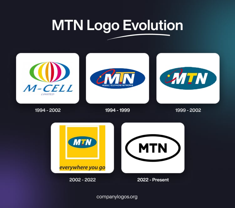
The very first logo of MTN was designed for M-Cell, or Mobile-Cell, its previous avatar, in 1994. It was composed of a colourful emblem and a wordmark. The emblem consisted of a stylised colourful sphere made of six vertically arched lines in green, yellow, orange, red, pink, and blue. Below it was mentioned the italicised wordmarks “M-Cell” and “Limited” in two levels and in different sizes. The two were written in blue with shadows and grey sans-serif typeface, respectively, in uppercase.

(1994 – 1999)
When MTN launched its cellular services on June 1, 1994, the South African telecommunications market was already competitive. The company needed a visual identity that would set it apart and resonate with the public. Early design concepts featuring red, black, and grey were quickly abandoned for failing to capture the brand’s spirit. The breakthrough came with the adoption of a deep blue oval badge.
The company name “MTN” was written inside the deep blue oval in white and yellow. Besides, there was a thin red orbit with a small yellow ball to the left of the company name placed diagonally. There was also a small red rectangle under the vertical bar of the short letter “T” in yellow. Also, the top bar of the letter “T” was extended unevenly on either side. Below the “MTN” lettering was mentioned the tagline “Mobile Telephone Networks” in white uppercase. This choice of colour gave MTN immediate visual differentiation and high visibility.

(1999 – 2002)
In 1999, the logo was redesigned again, wherein the tagline “Mobile Telephone Networks” was removed and the colour palette made a little lighter and calmer. For instance, the colour of the deep blue oval was changed to a muted sea blue. Also, the top bar of the letter “T” was redrawn to fit into the “MTN” lettering. The rest of the elements remained the same.

(2002 – 2022)
In 2002, the logo was redesigned to include a thick white square frame surrounding the muted sea blue oval. The two were placed inside a solid yellow square. Also, the thin red orbit accompanying the “MTN” lettering was removed. At the bottom of the yellow square was mentioned the slogan “everywhere you go” in black lowercase.

(2022 – Present)
On February 16, 2022, MTN unveiled its most significant logo overhaul since its founding. This minimalist version appeared in two colour options – black on white and black on yellow. At the centre of the logo is the bold sans-serif lettering “MTN” in black against a white/yellow background. It is further enclosed within a horizontally oriented oval with a thick black outline.


The Elements of the MTN Logo
Font
The thick and massive geometric letters used in the MTN logo are written using a bold and clean sans-serif font. The fonts that are somewhat similar to it are Neue Radial A Black and BR Nebula Black.
Colour
The colour palette of the MTN Group comes in two options. The first one is minimalistic black-and-white that appears professional and evokes notions of business and excellence. The second one is the black and yellow that appears dynamic and evokes power and passion.
Finally
The MTN logo and its various iterations show how the company grew from being a challenger in South Africa to a pan-African digital powerhouse. From its bold adoption of yellow in 1994 to its sleek, digitally-oriented identity in 2022, the MTN logo has become more than a corporate symbol. It is a beacon of connectivity, progress, and optimism for millions across Africa.