MSNBC is an American television channel known for broadcasting news programmes with a liberal perspective. Founded in 1996 and owned by NBCUniversal, the network has rebranded itself as MS NOW (My Source for News, Opinion and the World) in 2025.
The iconic MSNBC logo has undergone a remarkable transformation since the cable news network’s launch in 1996. From its original square design featuring the Microsoft-NBC partnership to the 2025 rebrand as “MS NOW”, the logo’s evolution tells the story of a network constantly adapting to changing media landscapes and corporate ownership structures. The article delves into the various logo changes undertaken by the MSNBC network, among other details.
The Genesis of the MSNBC Logo (1994 – 1996)
The precursor to MSNBC was the television channel America’s Talking. Its logo featured a big-sized letter “A” in red where its right leg was cut out in the shape of a star. In the foreground to the right was the letter “T” in blue. Both letters were set up against a yellow square. Beneath the emblem were written the words “AMERICA’S” and “TALKING” in blue using Futura Extra Bold and a modified version of ITC Avant Garde, respectively. A thin red horizontal line separated the two words.

(1996) (Prototype)
In 1996, MSNBC replaced America’s Talking and got the name “MS” from Microsoft and “NBC” from NBC. The prototype logo during the period contained a peacock tail that was part of the NBC logo in 1986. Designed by Steff Geissbuhler of Chermayeff & Geismar, the tail had six coloured feathers, namely, yellow, orange, red, purple, blue, and green.
At the centre of the feathers appeared the white silhouette resembling the neck and head of the peacock. Beneath the emblem was written the brand name “msnBC”, where “msn” was written using a Franklin Gothic typeface and “BC” using NBC Futura. Among the letters, “msBC” was depicted in black with grey shadows, while the slightly enlarged “n” was shown in red. This prototype was used for promotions to launch the channel.
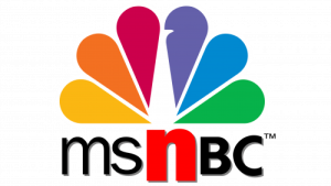
(1996 – 2000)
When MSNBC debuted on July 15, 1996, it represented an ambitious joint venture between Microsoft and NBC. The original logo reflected this partnership with a distinctive square-like design that featured “MSN” stacked vertically above “BC”, which was positioned alongside the iconic NBC peacock emblem.
The design utilised an Extended Extra Black sans serif typeface that was similar to the CNBC logo. The network experimented with variations during this period, including changing the letter “N” to red.

(2000 – 2006)
In the 2000 logo variation, the letter “N” was switched to black without changing any other element.

(2006 – 2009)
Around 2006, MSNBC made a design shift by adopting a horizontal layout that placed all five letters in a row beside the iconic peacock emblem. This change brought the logo closer in resemblance to CNBC’s established design and created a more streamlined appearance for on-screen use. The horizontal format would become the standard template for all subsequent MSNBC logo iterations.

(2009 – 2015)
In 2009, MSNBC introduced perhaps its most dramatic logo transformation. It switched the brand name from uppercase to lowercase letters and adopted the sans-serif Gotham Bold typeface. The lowercase letters featured gentler curves that were more closely aligned with modern design trends.
Also, the geometric lines of the lowercase letters created better harmony with the NBC peacock’s curved elements. They established visual coherence that had been lacking in previous iterations.

(2015 – 2021)
By 2015, MSNBC had returned to an uppercase design while maintaining the horizontal layout established in 2006. This iteration featured more refined spacing and bolder typography compared to earlier versions. It reflected advances in digital design capabilities and on-screen clarity requirements for high-definition broadcasting.

(2021 – 2023)
On March 29, 2021, MSNBC unveiled its logo update as part of a broader network redesign. The new logo maintained the familiar horizontal layout but introduced several subtle yet important changes. For instance, the NBC peacock and typography were adjusted to the same height. This corrected a proportion issue where the peacock had previously appeared slightly shorter. Further, the brand name was showcased using a Founders Grotesk Bold typeface.

(2023 – 2025)
MSNBC brought about another logo update on December 2, 2023. The typeface used to feature the brand name was changed to a custom-designed NBC Tinker Pro.

Transition to MS NOW (2025)
The most dramatic change in MSNBC’s logo history came about on August 18, 2025, with the parent company Comcast spinning off most of NBCUniversal’s cable networks into a new publicly traded entity called Versant. This separation necessitated removing all NBC branding elements, including the iconic peacock logo. The logo of the new entity called MS NOW (My Source for News, Opinion and the World) will feature a flowing banner emblem placed to the left of the wordmark.
The banner emblem with red and white horizontal stripes symbolises the American flag. The left-pointing arrow created by the negative space between the flag and the letter “M” is a subtle reference to the left-liberal positioning of the channel. Also, the flowing movement of the banner symbolises progress and energy. The wordmark “MS NOW” in white is set against a blue background with a gradient. It is written using a wide, clean, and geometric sans serif typeface to convey boldness and modernity. The full name of the new entity “My Source| News | Opinion | World” is written below the acronym “MS NOW” as a tagline in a title case, also in white.

The Elements of the MSNBC or the MS NOW Logo
Font
MS Now, formerly the MSNBC network, employs a wide, clean, and geometric sans serif typeface to emphasise boldness and modernity.
Colour
The colour scheme used by MS Now encompasses patriotic red, white, and blue. Here, the colour red symbolises valour and hardiness, while white symbolises purity and innocence. Blue symbolises justice, vigilance, and perseverance.
Finally
The evolution of the MSNBC logo reflects both design trends and corporate changes, as well as the broader transformation of news media in the digital age. So, what began as an innovative internet-television hybrid has transformed into MS NOW. The network’s visual identity has consistently adapted to serve both functional broadcast needs and strategic brand positioning.