Monster Beverage Corporation is a leading American beverage company that is best known for its flagship energy drink, Monster Energy, as well as other brands like Relentless, Reign, and Burn. The company’s roots date back to 1935, when it was founded in Southern California as Hansen’s, a family-run business selling fresh fruit and vegetable juices.
For decades, Hansen’s built a reputation for quality, especially in the western United States, before eventually expanding its product line to include sodas and other beverages. The unique logo of Monster Beverage Corporation has not changed and resonates with the youthful audience of the brand. The article delves into the history and evolution of the Monster Beverage Corporation logo, among other details of the company.
The Genesis of the Monster Beverage Corporation Logo (2002 – Present)
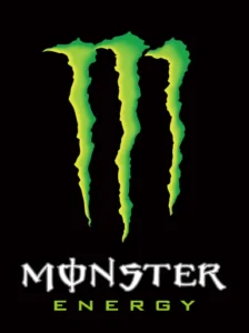
The Monster Energy logo was crafted by McLean Design, a Walnut Creek, California-based firm specialising in brand and packaging design. The goal was to create a visual identity that would instantly resonate with the brand’s target audience: energetic, adrenaline-seeking young adults, particularly those involved in action sports and rock music. The result was a bold, aggressive logo that perfectly captured the brand’s “Unleash the Beast” ethos. It features a graphical emblem and a wordmark, where the graphical emblem displays a large neon “M” in green with a black outline set either against a black or white background.
The imagery of the graphical emblem appears to be “torn” and similar to the claws of a monster trying to come out of the can. However, contrary to belief, the design is not of a beast that was mentioned in the Hebrew Bible but simply the work of an artist. The neon green colour of the emblem symbolises nature and energy, not to mention bravery, focus, and willpower. It is accompanied by the wordmarks “MONSTER” and “ENERGY” in two levels using a custom Bank Gothic typeface.

The Elements of the Monster Beverage Corporation Logo
Font
The letters used in the wordmark are written using a grotesque custom Bank Gothic typeface with different sizes of letters. The “O” letter in the wordmark displays an overlapping vertical bar.
Colour
The neon green colour used in the logo stands in sharp contrast to the black background. These two colours symbolise the core features of the product, namely, exclusive, aggressive, youthful, energetic, and exciting.
Finally
The Monster Beverage Corporation logo was designed by McLean Design in 2002. Its neon-green claw “M” set against a black background has become synonymous with energy, rebellion, and youthful vigour. The success of the logo lies in its ability to capture the spirit of its audience and stand out in a crowded marketplace.