Mitsubishi is a Japanese business conglomerate with diverse interests. It has footprints in multiple sectors, ranging from shipping to automobiles. The company has been a prominent player in the business world for over a century. This article traces the evolution of its logo through a vast time span lasting more than a century, among other details.
The Genesis of the Mitsubishi Logo (1870 – 1873)
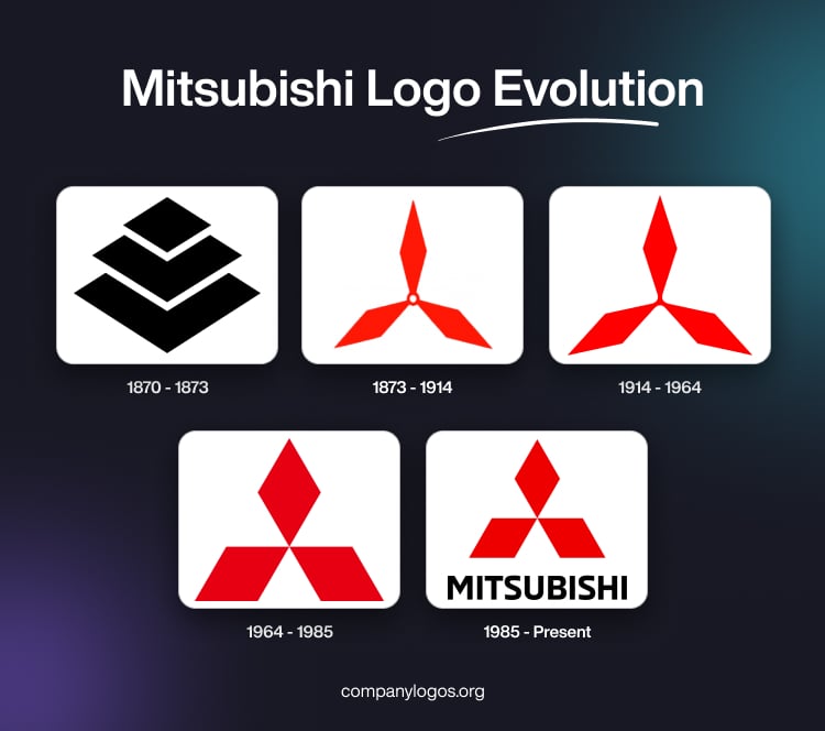
The original Mitsubishi logo depicted the words “mitsu,” or “three” and “hishi” or “water chestnut” as the company name was formed from these words. So, the image of the water chestnut plant is often used in Japanese to symbolise a diamond or rhombus. The original log, thus, combined the Iwasaki family crest with three overlapping diamonds of uneven sizes and a blade of three oak leaves. The logo featured both the symbols together.


(1873 – 1914)
The 1873 logo design featured an emblem comprising three thin rhomboids in red joined at the centre with a small hollow circle. The logo resembled an aircraft’s propeller and a ship’s blade.

(1914 – 1964)
The 1914 logo saw the circle at the centre of the emblem disappear, and replaced with an intersecting solid point. In 1955, the logo saw the addition of the wordmark written in Japanese in black.

(1964 – 1985)
The 1964 logo had a new shape wherein the design was balanced with three wide rhomboids in red. The upper rhomboid was narrower and rose above two broader elements lying sideways. The logo came in two variants – one with the brand name and one without.

(1985 – Present)
The logo of 1985 saw the addition of the brand name in black capitals and using a traditional sans-serif typeface. The letters of the brand name were characterised by straight lines. The word “Motors” was added later to the brand name to distinguish the auto business from other divisions of the company.

The Elements of the Mitsubishi Logo
Font
The Mitsubishi logo displays the company name in bold black letters below the diamond shape. While not always included, the name uses an uppercase sans-serif font with crisp lines. The unique Mitsubishi lettering matches their brand, similar to Neo Sans Std Bold or ED Northridge Sans Extra Bold fonts.
Colour
Mitsubishi’s colour palette comprising a bold mix of red and black has remained mostly unchanged since the 1870s. The vibrant red emblem conveys excellence and precision. The black lettering grounds the logo, and adds professionalism and confidence. This classic colour combination evokes the brand’s strength and expertise.
Finally
The evolution of the Mitsubishi logo provides a fascinating journey through the company’s growth, adaptability, and commitment to staying relevant in a dynamic business environment. From its early days as a shipping company to its current standing as a global automotive player, Mitsubishi’s logo has been a constant companion. It symbolises the brand’s values and aspirations. The Mitsubishi logo is a testament to the company’s resilience and innovation.