McLaren is a world-renowned name in the realms of motorsport and high-performance automotive engineering. Founded in 1963 by a New Zealand racing driver, Bruce McLaren, the company has grown from a small racing outfit into one of the most successful Formula 1 teams in history and a leading manufacturer of cutting-edge supercars. With a reputation built on speed, precision, and innovation, McLaren has consistently pushed the boundaries of technology. Its dominance in Formula 1 is associated with legendary drivers like Ayrton Senna and Lewis Hamilton.
The McLaren logo has undergone various transformations since it was conceived in 1963. The logo iterations show the journey of the brand as a premier sports car and its commitment to excellence and innovation in the automotive industry. The article delves into the evolution of the McLaren logo, among other details of the company.
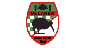
The Genesis of the McLaren Logo (1963–1965)
The original McLaren logo featured a red shield with a chequered flag in green at the top and a diagonal red line across the shield. A black silhouette of a Kiwi bird with her head down was meant to show she was looking for something. The image of the Kiwi bird was a nod to the legacy of Bruce McLaren, the founder. In the bottom section of the shield lay a solid red segment with the words “MOTOR RACING TEAM” in black uppercase. Near the top of the shield was written the name of the founder in black against a horizontal red banner. The top section of the shield had the silhouette of a racing car against a green background.

(1965 – 1967)
The second logo iteration in 1965 was almost the replica of the original logo, but with the change in lettering. The name of the founder at the top in the earlier logo was replaced with the wordmark “McLAREN”. The size of the wordmark “MOTOR RACING TEAM” in two levels was considerably bigger than the previous iteration.
(1967 – 1981)
Nicknamed Speedy Kiwi, the logo of 1967 showed the image of the bird in a stylish and modern way. The black silhouette had an elongated sharp beak with a pointed line at the bottom.

(1981 – 1991)
The 1980s ushered in a significant era for McLaren as it entered into a partnership with Marlboro. This collaboration had a profound impact on the logo, which became a canvas for intricate designs. It blended the essence of McLaren with the branding demands of Marlboro. Designed by Raymond Loewy, the Kiwi bird was replaced in this iteration with a checkered pattern in black, red, and white, as a tribute to the Marlboro sponsorship. Below the pattern was written a thick black wordmark “McLaren INTERNATIONAL” in two levels.

(1991 – 1998)
In the 1991 logo the checkered pattern was replaced by a red triangular arrow or a red chevron. The colour of the logo remained the same, while the typeface was slightly refined. Also, the word “INTERNATIONAL” was removed.

(1998 – 2003)
In the 1998 logo iteration, the red chevron was replaced with a swoosh symbol. The wordmark was written using both bold and soft lines.

(2003 – 2012)
In the 2003 logo update, only the typeface was changed. The letters feature more elegant lines and are rounded to symbolise the successful running of racing cars.

(2012 – 2018)
In 2012, the company was renamed to McLaren Automotive, which necessitated a logo change. However, not much was changed, but for the addition of the word “Automotive” in a different font.

(2018 – 2022)
The 2018 logo was modern, stylised, and simple. It depicted the wordmark “McLaren” in a sleek, custom sans-serif typeface in black to emphasise the sophistication and progressive nature of the brand. The key element in the logo was the stylised swoosh-like element in black to the top right corner of the letter “n”. Symbolising forward movement, the swoosh-like element represented the brand’s drive for speed, victory, and dynamism.

(2022 – Present)
The latest logo was introduced in 2022 and was designed by Miles Newlyn. It retained the previous logo design, but for the colour of the swoosh, which was changed from the previous black to orange.

The Elements of the McLaren Logo
Font
The McLaren wordmark is written using a custom sans-serif typeface where the heavy title case letters have smooth shapes. The fonts similar to the McLaren typeface include Snasm Heavy, Serene MTC, and Strelka Ultra. Also, the logo designers chose the vector version of Marcus Sterz’s Moki Lean typeface.
Colour
The colour palette of the McLaren logo comprises black, white, and red. The choice of colours conveys a sense of professionalism, open-air performance, and engineering excellence.
Finally
The McLaren logo and its iterations stand as a testament to the brand’s journey over the decades. These show how the brand with humble beginnings had, over the years, transformed into a marquee race car brand known for resilience, power, performance, and adaptability.