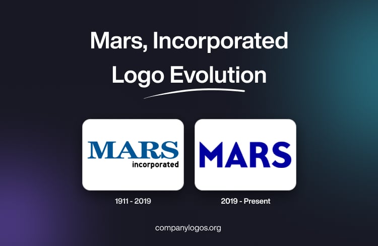
Mars, Incorporated is a global leader in confectionery, pet care, and food products. Over the decades, the visual identity of this US-based company has undergone several changes, which reflect shifts in design trends, consumer preferences, and corporate strategy. This article delves into the history and evolution of the Mars logo over the years.
The Genesis of the Mars, Incorporated Logo (1911 – 2019)
The original Mars, Incorporated logo featured the wordmark in a custom sans-serif typeface where the bottom ends of the letters were connected to each other. Besides, the serifs of individual letters were pointed. The logo showed the “Mars” wordmark in bold, uppercase, while the wordmark “Incorporated” in lowercase was displayed in black and in a smaller size.

(2019 – Present)
The 2019 logo variant in deep blue colour was designed by Jones Knowles Ritchie, and it featured the wordmark “Mars” in bold uppercase using a custom rounded typeface. The logo also featured a monogram comprising the letter “M” in a blue and green colour combination.


The Elements of the Mars, Incorporated Logo
Font
The Mars, Incorporated logo uses a bold, clear, modern, and custom sans-serif typeface. The choice emphasises professionalism and a no-nonsense, purpose-driven philosophy.
Colour
The Mars, Incorporated logo uses a deep blue colour to represent trust, legacy, and reliability.
Finally
The Mars, Incorporated logo shows the growth and adaptation of the company for more than a century. The story of its logo had humble beginnings with a simple wordmark, which has now evolved into its current dynamic and digitally optimised design. The Mars, Incorporated logo has continually transformed to reflect contemporary aesthetics and corporate values. These changes underscore the dedication of Mars, Incorporated, to innovation, consumer engagement, and a unified brand identity across its global operations.