Markiplier is the online persona of Mark Edward Fischbach, who is one of YouTube’s most recognisable creators. He is known for his Let’s Play videos, comedy sketches, and heartfelt vlogs. The name “Markiplier” is a combination of the words “Mark” and “multiplier”, which reflects his aim to create various types of content.
Markiplier has built a brand that extends far beyond gameplay. His logo has played an important role in symbolising his growth and evolution as a creator. In fact, his logo has become an iconic symbol within the gaming and digital entertainment community. The evolution of the Markiplier logo reflects both his personal brand growth and the playful, creative spirit that defines his content. The article delves into the evolution of the Markiplier logo since his YouTube channel began in 2012.
The Genesis of the Markiplier Logo (2012 – 2017)
The original visual identity of Markiplier was a minimalist, blocky, geometric, and monogram-styled “M” in red uppercase set against a black square background. The letter “M” represented the initials of Markiplier and stood out for its simplicity and character. The middle bars of the letter “M” were unique, for instead of having multiple bars aligned at each other, it had a straight bar near the top, which was disjointed in the middle. And the disjointed piece of the bar in the form of a square just hung a notch below.

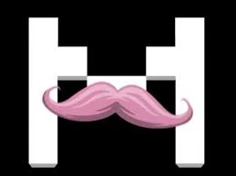
(2017 – Present)
The true breakthrough in Markiplier’s branding came with the introduction of the pink moustache, which was inspired by his comedic alter ego, Wilford Warfstache. This character, and the moustache itself, quickly became fan favourites. The pink moustache was soon integrated into the logo design, and it symbolises quirky humour and signature character.
In fact, it appeared as a stylised, cartoonish moustache that overlapped or was incorporated into the letter “M” in white, pink, or red against a black background. The playful nature of the logo resonated with his audience and helped cement his brand identity
The Elements of the Markiplier Logo
Font
The font used to depict the monogram “M” is arguably similar to Watermelon Regular. It is a bold and playful sans-serif typeface that has a blocky appearance. The letter “M” appears to stand out clearly, even in small sizes.
Colour
The colour of the Markiplier logo is vibrant and distinct. It has shades of pink and red that are supported by black and white tones in the background. The moustache, arguably the most iconic element, is displayed in an eye-catching and lively shade of pink.
Finally
The evolution of the Markiplier logo from simple beginnings to a playful, memorable emblem perfectly captures the essence of his brand. The pink moustache “M” remains a standout example of effective personal branding in the digital age. It symbolises both Markiplier’s humour and his close connection with his audience.