Mahindra is one of India’s most prominent industrial conglomerates. Established in 1945, the company initially was engaged in the production of steel. However, today, the company has diversified into several fields, which include automobiles, IT, defence, agricultural machinery, and hospitality, among others. The SUVs, trucks, and electric vehicles produced by the company are reputed for their ruggedness and reliability.
Mahindra’s rich legacy is reflected in its evolving visual identity as well. The journey of its logo mirrors the brand’s transformation from a steel trader in post-independence India to a global leader in mobility and innovation. The article delves into the evolution of the Mahindra logo over the years, among other details of the company.
The Genesis of the Mahindra Logo (1948 – 1966)
The original Mahindra logo design captured the industrial spirit of the company. It depicted a gear, hand tools, and an “MM” monogram. The clever integration of two “M” letters in lowercase formed the fingers grasping a tool. It was a visual embodiment of craftsmanship, engineering prowess, and a hands-on approach to building the new nation. The logo reflected strength and reliability, qualities dearly valued in India’s formative years.

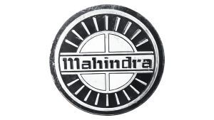
(1966 – 2000)
As Mahindra expanded its business in the 1960s, its identity evolved to reflect optimism and growth. The new logo introduced in 1966 in monochrome featured a circular black emblem with sunrays in silver to symbolise a new dawn and progress.
The “Mahindra” wordmark in bold title case and rendered using a custom font was placed at the centre of the emblem on a badge. In fact, the logo looked like a steering wheel. This period witnessed Mahindra’s expanding footprint in automobile and tractor manufacturing, and the logo demonstrated increased ambition and a forward-looking vision.
(2000 – 2012)
Entering the new millennium, Mahindra repositioned itself as a modern multinational entity. In 2000, the brand launched its most recognisable logo: a red oval containing a stylised letter “M” depicted through three upward-sloping lines. The red oval signified energy, passion, and progress.
Popularly termed the “Road Ahead,” this design is complemented by a bold grey wordmark in a custom typeface with playful tails and rounded lines. The logo represented speed, motion, and the company’s unwavering ambition. The motif of movement and dynamism was fitting for a brand leading innovation in mobility, technology, and finance.

(2012 – 2023)
In 2012, Mahindra refreshed its logo to underline its global and increasingly tech-driven identity. Designed by Landor, the wordmark “Mahindra” in the logo adopted sharper curves, pronounced diagonal cuts in select letters, and a deeper shade of red. The road motif was retained for its minimalist and strong design.

(2021 – Present)
As Mahindra entered a new era after 2021, the logo underwent its most radical transformation with the introduction of the “Twin Peaks” for its SUV division. This futuristic emblem features two chrome-infused, upward-pointing peaks forming the letter “M” to symbolise freedom, exploration, and next-level strength.
The visual identity aims to evoke a powerful sense of adventure, ambition, and “exploring the impossible.” It perfectly aligned with Mahindra’s positioning as a leader in innovation and adventure-ready vehicles. Interestingly, the wordmark “Mahindra” was removed from the logo.

(2023 – Present)
Designed by Pratap Bose, the latest logo iteration has been designed for the electric vehicles produced by the company. This logo with a minimalist and modern design features two symmetrical arcs in black joining at the middle to form an abstract letter “M.” The logo sports a sleek and contemporary look and represents the values of simplicity and clarity embodied by the company.

The Elements of the Mahindra Logo
Font
The Mahindra logo employs a custom rustic typeface to depict its visual identity for a long time. However, the latest logo iteration does not find mention of the wordmark.
Colour
The colour palette used to design the Mahindra logo comprises yellowish silver to evoke a sense of quality and excellence. The colour represents the stability and professionalism of the company.
Finally
The evolution of the Mahindra logo is more than a design journey; it is a symbol of India’s industrial rise and a testament to the brand’s agility. Each logo iteration reflects the ambitions, transitions, and unwavering commitment of the company to progress. So, be it the rugged industrial beginnings or the sleek “Twin Peaks” of today, Mahindra’s logos have signalled the brand’s drive to innovate, inspire, and lead.