LG Electronics Inc. is a South Korean multinational corporation that is best known for various innovations in consumer electronics and home appliance segments. It was founded in 1958 as GoldStar, and the company has since played a key role in rebuilding post-war South Korea by producing the nation’s first radios, televisions, and refrigerators.
Based in Seoul’s Yeouido district, LG Electronics operates as a core subsidiary of LG Corporation, which is one of South Korea’s largest conglomerates. The article traces the evolution of the various LG Electronics logos over the years, among other details of the company.
The Genesis of the LG Electronics Logo (1958 – 1961)
One of the constituents of LG Electronics was Goldstar, and its logo featured a crown-like geometric graphical emblem with 5-pointed spurs accompanied below by the handwritten wordmark “GoldStar” in black

(1961 – 1962)
In 1961, the crown-like graphical emblem with 5-pointed spurs in monochrome was enclosed within a circle with a thick outline in black. Below the emblem were mentioned the initials “GS” or “GoldStar” in Korean.

(1962 – 1963)
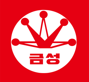
In 1962, the logo was refined by making the constituents of the graphical emblem, especially the spurs, slightly thinner. Further, the letters “GS” in Korean below were spaced apart.

(1963 – 1964)
The graphical emblem was further refined by making the sides of a few triangular elements, or spurs, especially those at the centre and extending to either side, thinner.

(1964 – 1965)
In the 1964 logo iteration, the small black circles atop the triangular elements or spurs were made to touch the inner circumference of the bigger circle. Also, the initials “GS” in the Korean language were written slightly above the edge of the circle below.

(1965)
The 1965 logo iteration saw a change in colour, from monochrome to red. The crown-like emblem with 5-pointed spurs was enclosed within a white circle, which was further enclosed within a red square.
(1965 – 1995) (Trademark – Korean)
The previous logo was further refined by making the edges of the spurs thicker and the elements slightly bigger. However, the size of the red square was reduced.

(1981 – 1995) (1981 – 2001) (Trademark – English)
This logo variant showed the initials “GS” in English and had all the triangular spurs marked in solid red.

(1975 – 1983)
The 1975 logo saw both the red and white graphical emblem and the wordmark “GOLD STAR” in a black sans-serif typeface in uppercase placed in a single line. The 5-pointed triangular spurs reverted to a combination of a solid red and white colour palette.

(1983 – 1995)
The 1983 logo variant saw the wordmark made more modern and futuristic. Written in a title case, there was no space between the “Gold” and “Star” words. The graphical emblem remained the same.

(1995 – 2014)
In 1995, the name of the company, “Lucky GoldStar”, was changed to LG Electronics. The logo of the period comprised a fuchsia red circular emblem and a bold grey wordmark, “LG Electronics”, on the right. The wordmark was written in a Helvetica font.
The circle had three white symbols inside: the letter “G” placed in the inner perimeter, the letter “L” placed at the centre, and a white dot placed on the upper left of “L”. The emblem looked like a stylised image of a smiling face.

(2014 – Present)
The current LG Electronics logo employs the burgundy red colour palette for the emblem. Similarly, the “LG Electronics” in the grey wordmark is modified to appear modern.

The Elements of the LG Electronics Logo
Font
The main logotype of LG Electronics uses a customised Helvetica Black typeface. Here, Helvetica is a well-known neo-grotesque sans-serif designed by Max Miedinger in 1957, and it provides the logo with modern clarity and geometric precision.
Colour
The colour palette of LG Electronics consists of LG Red, which symbolises friendliness, passion, and commitment to consumers. The colour white represents transparency and reliability. Cool grey is employed to achieve digital and print versatility. This colour scheme helps LG Electronics maintain an emotional and recognisable visual presence across product packaging, advertisements, and digital assets worldwide.
Finally
The evolution of the LG Electronics logo encapsulates the transformation of the company from a local pioneer into a world-renowned technology leader. Its logo began with the “Lucky Goldstar” emblem, which represented Korea’s optimism and industrial growth in the mid-20th century.
Later on, the visual identity evolved to align with its expanding global presence. In fact, the introduction of the iconic “L” and “G” face logo in 1995 marked a turning point. It symbolised humanity, friendliness, and innovation. The circular design represented the world and the company’s global vision.