The article explores the history and evolution of the logo over the years.
The Genesis of the Lay’s Logo (1932 – 1965)
The journey of Lay’s began in 1932, when salesman Herman Lay’s founded the company. He created the first logo by writing his last name in a vintage Western font with a stylised design. The emblem showed cookware, such as a kettle, a vat, a pot, or a food bowl. The bottom of the cookware showed wavy lines, which meant a hot cooking surface. The same line was present on the right side of the letter “L,” while the stem of the lowercase letter “y” protruded downwards in red.
The logo showed the humble beginnings of the Chips brand, which incidentally started as a side business for Mr. Lay’s. Later, in 1965, Mr. Herman Lay’s Frito Company merged with PepsiCo, thus giving rise to a new era in Lay’s brand journey.

(1965 – 1986)
In 1965, the logo was updated to a more modern design while retaining the red background and white lettering. The shape became a stricter rectangle with rounded corners, and the font was changed to an ExtraBold sans serif style. Notably, some letters (L, y, and the apostrophe) extended beyond the rectangle, which introduced a dynamic element to the logo.

(1981 – 1984)
The logo of 1981 was a refinement of the previous logo and had the contours of the letters of the brand name in the red background extended for certain elements (L, y, and the apostrophe). Besides, even the lower horizontal bar of the letter “L” was extended below the level of the letters “a” and “s.”

(1986 – 1997)
The logo underwent another redesign in 1986, where it was italicised for a more dynamic appearance. The rectangular background was removed, and in its place appeared the letters with their contours running along the entire wordmark. These allowed the letters to stand out more prominently. This version maintained the red and white colour scheme but introduced thicker lines for a bolder look.

(1997 – 2003)
In 1997, a significant change occurred with the introduction of yellow into the logo. A yellow circle resembling a sun was added behind the wordmark, which was now placed on a red ribbon. Besides, the white letters had blue shadows that showed the wordmark in a three-dimensional form.

(2003 – 2007)
The logo was slightly modified at the end of 2003 to incorporate deeper three-dimensional effects. The ribbon became more pronounced with dark red gradients, and the edges of the yellow circle were stylised with flame-like swirls. This iteration emphasised movement and dynamism. Besides, the shadows of the letters were changed to burgundy from blue.

(2007 – 2019)
In 2007, Lay’s introduced a new three-dimensional logo featuring a golden yellow ball that represented both chips and sun imagery. The design maintained the bold wordmark while simplifying some elements for clarity. This logo remained in use until another redesign in 2019.

(2019 – 2025)
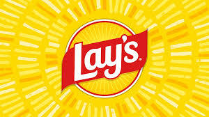
The latest redesign in 2019 reverted to a flatter design while preserving key elements from previous logos. The intense yellow and red colours returned with white lettering on a banner surrounding the yellow circle. This version aimed for a more modern aesthetic while still evoking nostalgia for earlier designs.

(2025)
PepsiCo has undertaken a brand redesign with a new logo that shows a warmer yellow shade for the sun. Besides, the red ribbon showing the brand name in white is extended beyond the circular emblem on both sides. The changed custom typeface depicting the brand name is written at an angle, while the circular emblem is given a red outline. The refined colour palette of the logo is inspired by the ingredients and contains colours such as pickle green, savoury red, and hickory brown.
The Elements of the Lay’s Logo
Font
The Lay’s logo features the brand name in white. The custom typeface of the brand name boasts a sleek and sophisticated appearance by balancing elegant curves with bold and confident strokes. The typeface used in the logo reminds one of fonts like Makozin Heavy Italic and Bluestar Medium Italic. However, it holds its own with unique adjustments.
Colour
The logo’s vibrant colour scheme, comprising a sunny yellow paired with a bold red, exudes energy, power, and passion. This colour scheme is further tied to the clean white to symbolise professionalism and reliability. This combined palette of sunny yellow, old red, and clean white effectively communicates Lay’s commitment to both the quality and taste of its products.
Finally
The Lay’s logo and its various iterations reflect broader trends in branding and marketing within the snack food industry. Each redesign has been carefully crafted to resonate with consumers while maintaining core elements that honour the brand’s heritage.