Land Rover is one of the most renowned automotive brands, which is known for its rugged off-road vehicles and luxurious SUVs. Since its inception in 1948, the British automotive brand has undergone numerous design and branding changes, which included modifications to its emblem. Presently, the company is owned by the Indian company Tata Motors. The Land Rover logo has evolved over time to reflect the brand’s heritage, durability, and commitment to excellence.
The Genesis of the Land Rover Logo (1948 – 1960s)
The first Land Rover logo was introduced in 1948 when the brand debuted its inaugural off-road vehicle, the Series I. The design was simple yet effective and featured an elliptical badge with a dark grey background and white text. The words “Land Rover” were prominently displayed in capital letters with a connecting zigzag line to symbolise motion and adventure. It also mentioned the inscriptions “Solihull Warwickshire” and “England” as a reference to the brand’s origin.

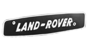
(1960s – 1968)
With the launch of the Series II, the Land Rover logo underwent subtle refinements. It featured the brand name “Land-Rover” in white uppercase against a black rectangular background with thin white framing and rounded corners. The logo was tilted to reflect the fact that Land Rover vehicles can overcome hills and challenges. Additionally, there were two bold dots at the top left and bottom right of the rectangular frame to symbolise screw heads.
(1968 – 1978)
In 1968, the logo featured an oval with a black background and yellow framing. Written in two levels, the brand name in bold yellow was slanted, and the zigzag line was split in two.

(1978 – 1986)
In 1978, Land Rover became an independent subsidiary of British Leyland and was officially named Land Rover Limited. This period saw a subtle redesign of the previous oval-shaped logo, with the black background being replaced with emerald green and yellow being replaced with light gold.

(1986 – 2021)
As part of the Rover Group, Land Rover updated its logo in 1986 to give it a more contemporary appearance. The emerald green oval background became more vibrant and showed a gradient. The font was refined and executed from a Gill Sans family where the individual letters had one-sided spikes at their top with shadows for a sleeker look. The overall design remained familiar to emphasise brand consistency while enhancing visual appeal.

(1996 – 2021)
In 1994, Land Rover was acquired by BMW, which led to further modernisation of the logo. The German automaker ensured that Land Rover maintained its heritage while subtly refining its branding. Looking more like the 1978 version, the green and white colour scheme was made brighter and the finish became glossier. It added a touch of sophistication to align with the premium direction of the brand.

(2021 – Present)
In 2021, the redesigned logo changed the colour palette to black and white. The outer edge of the oval had a thicker black framing, while the inner edge had a thinner one. Both the frames were separated by a thick white frame. The wordmark in black was redrawn subtly without any accompanying shadow.

(2023 – Present)
The company got a new name—JLR, where “J” stood for the brand Jaguar. The combined Jaguar Land Rover logo featured the monogram “JLR” in black capitals. Besides, the removal of the vertical bar of “R” brought more style and sophistication.

The Elements of the Land Rover Logo
Symbol
The Land Rover emblem features a distinct oval shape with a frame that prominently displays the car brand’s name at its centre. A zigzag, split into two sections, complements the inscription. While the background has undergone changes over time, the core design has remained consistent. According to legend, the inspiration behind the emblem came from a greasy imprint left on paper by a sardine can.
Font
The typography used in the emblem is Gill Sans Bold Italic, which is a typeface designed by Eric Gill in 1930.
Colour
The colour palette has evolved more than the emblem’s shape or typography. Initially, it was solely grey, but over time, emerald green, yellow, white, and silver were introduced.
Finally
The Land Rover logo variants reflect the brand’s journey through different ownerships, technological advancements, and shifting design trends. While the core essence of the emblem has remained consistent, each modification has added a touch of modernisation and sophistication. Today, the Land Rover logo stands as a symbol of rugged capability, luxury, and innovation, thereby reinforcing its status as a leader in the global automotive industry.