KuCoin is a global cryptocurrency exchange that was founded in 2017 with the goal of making digital asset trading accessible, secure, and user-friendly. It is often referred to as “The People’s Exchange” and has grown into one of the world’s leading platforms for trading cryptocurrencies. It serves millions of users across more than 200 countries.
Based in Seychelles, KuCoin provides a wide range of services beyond spot trading. These include futures, margin trading, staking, lending, and its own blockchain ecosystem. The platform is also known for its native token, KuCoin Token (KCS), which offers users benefits such as trading discounts, revenue sharing, and participation in platform governance.
KuCoin has introduced two main logos in its history. The first logo was introduced right upon its official launch in 2017. Later, in the year 2023, a refreshed logo, which formed part of a comprehensive visual identity, was announced ahead of its sixth anniversary in July 2023. The article delves into the evolution of the KuCoin logo, among other details of the company.
The Genesis of the KuCoin Logo (2017 – 2023)
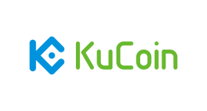
The original KuCoin logo featured the brand name “KuCoin” in the KuCoin Sea Green colour and written using a sans-serif typeface with letters having rounded ends. It also had a small geometric emblem in blue that read as a stylised “K” with a “coin” inside. The central dot or coin, also in blue, communicates a focal point and reinforces the idea of the coin.
(2023 – Present)
The 2023 logo was designed to celebrate the 6-year anniversary of the company. The design was a refined version of the previous logo and conveys KuCoin’s unwavering commitment to innovation and competitiveness in the world of cryptocurrencies. Besides, the design is based on three themes – blockchain, metaverse, and AI. The whole logo (logomark + logotype) was depicted in a KuCoin Sea Green colour. The brand name in uppercase was depicted using a custom geometric sans-serif typeface.

The Elements of the KuCoin Logo
Font
The KuCoin logo uses a custom geometric sans-serif font for its wordmark to convey modernity, clarity, and innovation. The characters are bold and rounded and reflect KuCoin’s emphasis on technological advancement and a welcoming user experience. While the exact name of the font isn’t publicly disclosed, the style shares visual similarities with fonts such as Gotham Rounded and Montserrat. The above-mentioned fonts are characterised by their simple and approachable glyphs.
Colour
The colour palette used to design the KuCoin logo contains a distinctive shade of green called “KuCoin Sea Green” to communicate reliability, trust, and a sense of community.
Finally
The evolution of the KuCoin logo reflects the transformation of the company from a young crypto exchange in 2017 into a global blockchain ecosystem with millions of users. It began with a simple wordmark but soon adopted its now-iconic “K + coin” emblem. It was a geometric design that embodies both the brand name and the core idea of digital currency.