Skip to content
Home » Famous logos » The History and Evolution of the KTM Logo

The History and Evolution of the KTM Logo

KTM Logo Evolution

KTM, or Kronreif Trunkenpolz Mattighofen, is a global powerhouse in motorcycle manufacturing. It traces its roots back to 1934, when Hans Trunkenpolz founded a fitter’s shop in Mattighofen, Austria. Initially, the enterprise focused on vehicle repair and manufacturing spare parts. In fact, the name “KTM” itself represents the founders and the location of the brand.

It is the first company to have manufactured four-engine motorcycle models with an air-cooling system. The logo of KTM has evolved over the years, and each iteration showcases the journey of the company and its technological advancements. The article throws light on each KTM logo, among other details of the company.

The Genesis of the KTM Logo (1953 – 1954)

The first motorcycles under the KTM name featured a tiger logo to symbolise speed and agility. In the logo, the tiger was shown walking through a ring that had the abbreviated letters “KTM” attached at the top in an arc. The logo was depicted in shades of orange and black. However, this logo was not given any official status.

KTM Logo (1953 - 1954)

(1954 – 1958)

The first official KTM logo debuted when Ernst Kronreif joined as an associate. This version showcased the playful and stylised initials “KTM” in blue inside an orange oval. There was an inverted swoosh symbol at the bottom of the wordmark. This era marked the beginning of a consistent brand identity, although the logo was still evolving in shape and colour.
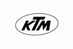
KTM Logo (1954 - 1958)

(1958 – 1962)

While still not standardised, the next logo variant in monochrome focused on the abbreviated “KTM” in streamlined lettering within an oval. This became the basis for future designs. The font became more italicised, and a black outline was added for contrast.
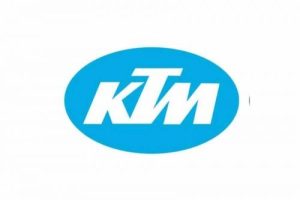
KTM Logo (1958 - 1962)

(1962 – 1978)

After inheriting the company, Erich Trunkenpolz updated the logo. The background shifted to light blue, while the letters became white. The font was adjusted to a more modern look with thicker and connected letters. The oval shape was retained to reinforce brand recognition.
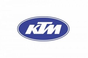
KTM Logo (1962 - 1978)

(1978 – 1989)

In the logo iteration of 1978, the overall design was stretched, and the background blue became more prominent. The typeface became stronger and more balanced, and the addition of a white outline lent modernity to the design. This marked a period of sporting success for KTM, which coincided with its first world championship title.

KTM Logo (1978 - 1989)

(1989 – 1992)

A significant redesign came after KTM was acquired by the TAUS-Gruppe. The oval was removed, and a blue-and-red colour palette appeared. A new tagline, “Fun in Motion,” in red encapsulated the brand’s spirit. This move signalled a drastic shift from tradition toward modernism. The logo encapsulated an abstract emblem to its left comprising a half circle cut into several thin lines.

KTM Logo (1989 - 1992)

(1992 – 1996)

With Stefan Pierer taking the helm, KTM further refined the previous logo. The logo highlighted “Motorcycles” as the tagline in red. During this period, the company sharpened its visual identity and showed its motorcycle focus.

KTM Logo (1992 - 1996)

(1996 – 1999)

In the 1996 logo iteration, KTM made orange the core colour. The logo was simplified and stripped to just the stylised “KTM” nameplate. There were no ovals or taglines. Designed by KISKA, this logo expressed strength, energy, happiness, and simplicity.

KTM Logo (1996 - 1999)

(1999 – 2003)

In 1999, the logo design was sharpened, while the colour palette was changed to orange and black. The abbreviated wordmark “KTM” with an enlarged “T” and an extended horizontal bar was executed in black. The logo had a tagline “sportmotorcycles” in orange uppercase italics letters.
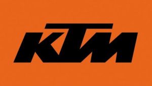
KTM Logo (1999 - 2003)

(2003 – Present)

The current logo version was introduced in 2003, and it continues the minimalist theme. Here, the abbreviated “KTM” is executed in bold, angular lettering, with strict lines in black. The wordmark is placed within an orange background for better contrast and to add more power and passion. This logo remains unchanged, and it represents clarity, modernity, and a connection to KTM’s adventurous DNA.

KTM Logo (2003 - Present)

The Elements of the KTM Logo

Font

The three-dimensional appearance of the KTM wordmark is derived from a custom and bold proprietary typeface with clean lines.

Colour 

The KTM logo is designed using a combined colour palette of orange and black. Here, orange represents energy, excitement, and innovation. It’s an industry-defining colour that instantly marks a motorcycle as KTM’s, both on and off the track. The colour black, on the other hand, provides a powerful contrast. It adds seriousness and technical authority to the vibrant orange.

The History of KTM

KTM began its journey in 1934 when Austrian engineer Hans Trunkenpolz founded a vehicle repair shop in Mattighofen, Austria. The shop was initially known as Kraftfahrzeug Trunkenpolz Mattighofen. The early years of the company were focused on repairing and selling DKW motorcycles and Opel cars. During the Second World War and into the postwar era, the business maintained its emphasis on vehicle maintenance.

With postwar shortages, KTM began manufacturing crucial spare parts. Soon it became one of the top repair workshops in Upper Austria. In the early 1950s, KTM expanded into motorcycle production. Its first motorcycle prototype, the R100, was developed in 1951, and by 1953, mass production had begun. Around this time, Ernst Kronreif, an influential businessman, became a major stakeholder. This led to the official registration of the company as Kronreif & Trunkenpolz Mattighofen (KTM).

The early rise of KTM was marked by several milestones. For instance, in 1954, the company sold its 1,000th motorcycle and claimed victory in the Austrian 125cc national championship. Two years later, in 1956, KTM competed at the prestigious International Six Days Trials, where Egon Dornauer won a gold medal for the brand.

During the late 1950s and into the 1960s, KTM expanded its product lineup with models such as the R125 Tourist, the sporty Trophy 125cc, and the Mecky moped. The 1960s also saw the company diversify into the production of bicycles. By 1970, KTM was manufacturing its own engines, thereby achieving greater technological autonomy.

By the 1980s, KTM had gained international recognition, especially in the off-road and motocross sectors. However, the company began to face significant economic challenges as moped and scooter sales declined. These difficulties led to a production halt in the late 1980s, and by 1991 KTM entered bankruptcy. The company was subsequently split into four separate entities, where each focused on motorcycles, radiators, bicycles, or tooling.

The motorcycle division was restructured as KTM Sportmotorcycle GmbH in 1992, which made a fresh start under new leadership. Stefan Pierer emerged as a key figure who helped guide KTM out of bankruptcy. He was able to do so by focusing on high-performance, quality motorcycles for both road and off-road markets.

KTM underwent a dramatic transformation in the mid-1990s. It embraced its now-famous orange branding while simultaneously developing an array of high-performance sport and dual-sport motorcycles. During this era, KTM expanded significantly. It acquired Husaberg AB in 1995 and Husqvarna in 2013. With these acquisitions, it added the off-road heritage of Sweden to its portfolio.

Through the 2000s and 2010s, KTM established itself at the forefront of motorcycle technology. It earned accolades for its motocross, enduro, and adventure bikes and became the largest motorcycle manufacturer in Europe by 2015. KTM is recognised globally for its bold orange motorcycles, extensive motorsport achievements, and innovative engineering, which includes both traditional and electric models. Its Mattighofen headquarters symbolise the company’s modern, international outlook, with KTM products sold and raced around the world.

Interesting Facts About KTM

  • Founded in 1953, KTM takes its name from Hans Trunkenpolz (a metalworking shop owner) and Ernst Kronreif (an investor). The “M” stands for Mattighofen, the town in Austria where the company is headquartered.
  • It began as a repair shop in 1934 and evolved into a motorcycle manufacturer after the Second World War.
  • KTM is globally recognised by its bold orange branding, which it adopted in the 1990s to distinguish itself in races and showrooms.
  • KTM has dominated the Dakar Rally by winning 18 consecutive titles (2001–2019) in the motorcycle category.
  • The company is a legend in motocross, enduro, and supercross disciplines.
  • The official slogan of the brand is “Ready to Race,” which is not just marketing. In fact, KTM designs most of its bikes with performance-first engineering. They are suitable for competition-level use straight out of the showroom.
  • The Indian automotive giant Bajaj Auto owns about 48% of KTM AG. Many KTM bikes, like the Duke and RC series, are manufactured in India.
  • KTM is known for its use of lightweight frames and powerful engines, especially in categories like 125cc, 390cc, and 790cc.
  • Its two-stroke and four-stroke off-road bikes are particularly loved for their balance of agility and power.
  • KTM is part of the Pierer Mobility AG, which also owns Husqvarna Motorcycles and GasGas, two other major off-road brands.
  • KTM has ventured into electric bikes with its KTM Freeride E-XC, which is an off-road electric bike. The brand is investing heavily in future e-mobility.
  • KTM entered MotoGP in 2017, and by 2020, it secured its first premier class win with Brad Binder at the Czech Grand Prix.
  • Unlike many motorcycle companies, KTM maintains a significant in-house R&D team. This ensures top-tier design, testing, and innovation capabilities.

Finally

The KTM logo is now an instantly recognisable symbol worldwide that embodies the values of adventure, boldness, and cutting-edge engineering. Its minimalist, bold design, unified across all platforms, ensures KTM “owns” its visual identity with unmatched consistency in the motorcycle industry.

The evolution of its logo shows the rise of the company from a small Austrian workshop to a global leader in motorcycle manufacture. Each logo redesign reflects growth, innovation, and an unwavering commitment to performance and adventure.

Leave a Reply

Your email address will not be published. Required fields are marked *