KT Corporation is one of the largest and most influential telecommunications companies in South Korea, and it is widely known for being the driving force in the nation’s digital transformation. It was originally founded as a state-owned entity and has since evolved into a leading provider of mobile, broadband, and integrated ICT services.
The company has played a key role in building South Korea’s world-class communications infrastructure, which ranges from early fixed-line networks to cutting-edge 5G and AI-powered platforms. The article explores the various logo changes undertaken by KT Corporation over the years, among other details about the company.
The Genesis of the KT Corporation Logo (1981 – 1991)
KT Corporation used to be called the Korea Telecommunications Authority at the time of its founding. Its logo featured a graphical emblem and the initials “KTA” in a blue and white colour combination. The graphical emblem consisted of two bubble-like elements in different shades of blue. Two inverted “U” elements featured inside the bubble. The initials are written in a geometric typeface, where the letterforms are characterised by bold glyphs.

(1991 – 2001)
In 1991, KTA became Korea Telecom, and the logo featured a geometric circular emblem with diamond shapes and parallel lines inside in blue and white. The design symbolises the interconnectedness of telecommunications networks. The wordmark “Korea Telecom” in both Korean and English featured alongside the emblem in black.

(2001 – 2009)
In 2001, Korea Telecom was officially rebranded as KT Corporation and necessitated a long change. The new logo featured an italicised wordmark “KT” in uppercase and written in a sans-serif typeface in dark blue. Also, the top ends of the initials “KT” touched each other.

(2009 – 2011)
In 2009, KT and its mobile subsidiary KTF came together and brought about a refreshed logo to represent the unified services (fixed line and mobility). The logo featured the initials “kt” in lowercase in black. Furthermore, the horizontal bar of the letter “t” appeared in the form of a red ribbon enveloping the nearest segment of the letter “k”. The glyphs of the letters had pointed serifs at their top. The connecting ribbon symbolised the unified services.
(2011 – 2020)
In 2011, a sleeker and more refined version of the logo was introduced. Although it continued with the previous design, the letterforms were made flatter. The fluttering red ribbon connecting the letters symbolised passion and innovation.

(2020) (Logo for Covid)
The KT logo was revised in 2020 to signify the need to maintain social distancing during the Covid-19 pandemic. Accordingly, it showed the letters “k” and “t” placed at a distance with a stretched red ribbon between them.

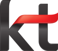
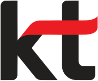
(2020 – Present)
The 2020 logo refinement saw the continuation of the iconic black letterform and red ribbon. The only changes were the more balanced letters “k” and “t” and the overall logo’s optimisation for digital use.
The Elements of the KT Corporation Logo
Font
The wordmark used in the KT Corporation logo features a clean and modern sans-serif typeface to convey simplicity, strength, and sophistication. The letterforms are characterised as bold and geometric with smooth curves.
Colour
The KT Corporation is designed using a colour combination of black and red, where black represents stability and trustworthiness, while red stands for energy, innovation, and forward momentum.
Finally
The KT Corporation logo and its various iterations show how the company progressed from a national telecommunications provider into a forward-looking global digital innovator. Each logo redesign has captured a key moment in KT’s journey. Over the years, the logo has gradually shed ornamental elements in favour of cleaner lines, bolder typography, and a contemporary aesthetic. It finds itself aligned with KT’s mission to lead in connectivity, 5G, AI, and digital platform services.