Kraken is one of the world’s leading and most trusted cryptocurrency exchanges, which is known for its emphasis on security, transparency, and regulatory compliance. Founded in 2011 by Jesse Powell and officially launched in 2013, Kraken was created to provide a safer and more reliable alternative to early exchanges like Mt. Gox. Based in San Francisco, California, the platform quickly gained recognition as a pioneer in the digital asset industry.
The Kraken cryptocurrency exchange logo has evolved since the company’s founding in 2011. It reflects growing trust, professionalism, and the spirit of innovation. The article delves into the evolution of the Kraken logo, among other details of the company.
The Genesis of the Kraken Logo (2011 – 2019)
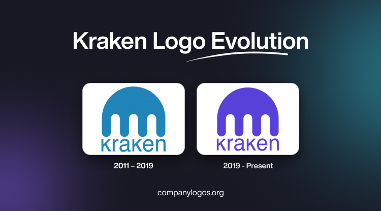
The original Kraken logo featured a graphical emblem and the brand name. The graphical emblem symbolised “Kraken”, the fictional sea monster that destroyed ships in the ocean. The emblem looked like a bold, semi-circular arch representing the creature’s mantle. It had descending lines suggesting tentacles. The wordmark accompanying the graphical element was written below using a sans-serif typeface to communicate modernity with clarity. The colour palette of the graphic emblem was teal, which fit the marine theme.

(2019 – Present)
The 2019 logo update was mostly related to the change in the colour palette. It was changed from the earlier teal to deep purple to reflect the company’s emphasis on professionalism and trust. Besides, purple is also associated with the attributes of ambition, wisdom, and creativity, which align with the Kraken’s mission for innovation.

The Elements of the Kraken Logo
Font
The wordmark of the Kraken logo is designed using a typeface that resembles a range of free and paid typefaces. These include Yoxall Regular by Roger White and Protestant DGL Regular by Digital Graphic Labs. Interestingly, although the letters are of the same size, the “Ks” are in uppercase, while the rest of the letters are in lowercase.
Colour
The graphic and wordmark that form part of the logo appear in dark purple against a white background. The colour shade appeals to the “brightest, colourful, and interesting minds”, in other words, the clients and team members.
Finally
The evolution of the Kraken logo shows the growth of the company. Subtle refinements and deep symbolism have enabled Kraken to maintain a forward-looking, trustworthy image in a rapidly changing industry.