Klipsch is an iconic American audio brand known for crafting high-performance loudspeakers and sound systems. It was founded in 1946 by engineer and audio pioneer Paul W. Klipsch, and the company began with a revolutionary approach to loudspeaker design. In other words, it was focused on horn-loaded technology, a principle that continues to define its signature sound today.
Over the decades, Klipsch has grown from a small workshop in Hope, Arkansas, into a globally respected name in home audio, cinema sound, and personal audio products. It remains one of the most influential and enduring brands in the world of high-fidelity sound. The article explores the various logo changes undertaken by the company, among other details of the company.
The Genesis of the Klipsch Logo (1946 – 19??)
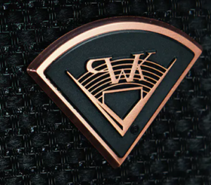
The initial Klipsch logo features a loudspeaker emitting sound waves in circular wave fronts. It is based on the principle that all speakers perform better when placed in a corner, irrespective of their basic design. The corner is depicted using two long and thin divergent arrows pointed at both ends and converging at a point.
Coloured in solid black and white, the thin arrows feature a series of sound waves with the stylish monogram “PWK” in the foreground. The graphical elements are enclosed within a few concentric circles of alternate thickness. The name of the founder, the founding year, and the location are placed along the edge of the circles.

(19?? – 2009)
The Klipsch wordmark in a light brown colour logo is depicted inside a black oval with a thin light brown outline. The wordmark is written using an elegant sans-serif typeface. The long, thin arrows of the previous logo, which looked like a stretched letter “V” are reproduced here in a light brown colour below the wordmark.

(2009 – Present)
The current logo depicts the wordmark in a geometric and bold sans-serif typeface. The monochromatic colour black conveys a universal appearance, simplicity, and elegance.
The Elements of the Klipsch Logo
Font
The wordmark used in the Klipsch logo is written using a bold, monolithic sans-serif typeface, which is similar to the Nuber Next Black Wide typeface. The letters of the logo are characterised by large size, close spacing, and a dense composition. The typeface conveys reliability and sophistication.
Colour
The logo is designed using a monochrome black colour scheme that symbolises confidence, solidity, and technological excellence.
Finally
The evolution of the Klipsch logo reflects the journey of the brand from a small, pioneering loudspeaker workshop to a globally respected force in high-fidelity audio. The logo has undergone refinements over the decades; that is, it shifted from more classic, serif-based forms to the clean, modern wordmark used today. Further, its visual identity has consistently conveyed strength, precision, and engineering integrity.