Keurig Dr Pepper is a US-based beverage company that produces a range of hot and cold beverages. It was founded in 1992 and 1885 as Keurig and Dr Pepper, respectively, and operates from Burlington, Massachusetts. The famous brands belonging to the company portfolio include 7UP, Dr Pepper, Green Mountain Coffee, Snapple, Keurig, and the original Doughnut Shop.
With notable subsidiaries and joint ventures, such as with Nestlé S and the Beverage Partners Worldwide, Keurig Dr Pepper is a major player in the industry and competes with PepsiCo and Coca-Cola. The company came into being through the merger of Keurig Green Mountain and Dr Pepper Snapple Group in 2018. This article focuses on the iconic logo of the brand, among other details of the company.
The Genesis of the Keurig Dr Pepper Logo (2018 – Present)
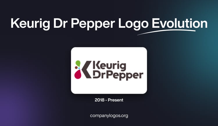
The logo of Keurig Dr Pepper was designed after the merger of Dr Pepper Snapple Group and Keurig Green Mountain on July 9, 2018. It features the combination of a graphical emblem and the brand name written in two levels. The graphical emblem consists of the letter “K”, where the vertical bar of the letter is replaced by four geometric figures of different sizes and colours resembling water droplets and circles. To the right of the emblem is mentioned the brand name in black and in two levels.
The wordmark “Keurig” is written in a contemporary bold sans-serif typeface, and there is a distinct gap within the letter “K” between its vertical bar and the arrowhead. In the second level, the wordmark “Dr Pepper” is written in the title case without any gap between the letters. The vertical bar of the letter “D” is slightly short at the bottom and does not meet the arched part.

The Elements of the Keurig Dr Pepper Logo
Font
The Keurig Dr Pepper logo is distinct from the individual Dr Pepper or Keurig brand logos and reflects a modern, bold approach to typography and colour. It uses a contemporary sans-serif font that is clean, highly legible, and designed for versatility across digital and print media. The typography is typically bold and does not have the elongated lines of Dr Pepper’s italicised, unique font. Instead, the Keurig Dr Pepper corporate logo prioritises clarity and professionalism.
Colour
The official colour palette used in the Keurig Dr Pepper logo consists of three primary colours: black, rose, and bright green. These colours are used in various combinations across the company’s branding materials, with black often serving as the main text colour. Here, rose and bright green provide striking accents that differentiate Keurig Dr Pepper from its competitors and individual brand identities. This colour scheme is energetic and modern and reflects the commitment of the company to innovation and its broad portfolio of beverages.
Finally
The Keurig Dr Pepper logo is a colourful and minimalist one, and reflects the brand’s journey through market changes and design trends. Its evolution shows shifts in consumer preferences, technological advancements, and the need for brand distinction in a crowded marketplace. Today, the Keurig Dr Pepper logo represents the heritage of Dr Pepper and the forward-looking vision of a modern beverage conglomerate.