KEF is a premier British loudspeaker manufacturer known for its innovative approach to high-fidelity audio design and engineering. It was founded in 1961 by Raymond Cooke, who was a Royal Navy veteran and a former BBC engineer. KEF or Kent Engineering & Foundry, quickly established itself as a pioneer in the world of acoustic technology. Based in Maidstone, Kent, England, the company has earned global recognition for precision sound reproduction and modern design aesthetics.
Over the decades, KEF has introduced numerous groundbreaking technologies. Among these is the Uni-Q driver array, which delivers a more natural and immersive listening experience. It does so by positioning the tweeter at the acoustic center of the midrange cone. KEF offers a wide range of products including hi-fi speakers, wireless audio systems, subwoofers, and headphones. These combine cutting-edge innovation with timeless craftsmanship. The article delves into the evolution of the KEG logo, among other details about the company.
The Genesis of the KEF Logo (1961 – 1970s)
Although there is no documented image of the original KEF logo, it was more likely the initials “KEF” displayed in bold uppercase, arguably in a sans-serif typeface, and enclosed within an oval.
(1970s – 1980s)
The logo designed in the seventies featured a large image of a speaker containing the initials “KEF” in uppercase.

(1980s – 2021)
The logo iteration in the eighties saw the tagline “The Sound of Loudspeakers” added below the speaker emblem with the initials “KEF” in bold uppercase.

(2011) (50th Anniversary Logo)
The 50th anniversary logo of KEF featured the speaker logo with the tagline “INNOVATORS IN SOUND” and accompanied by the numerals “50”. The number “O” was placed comprising three concentric circles of varying radii and outlines. Besides, the innermost circle had 6 arrow-like elements converging at the centre.

(2021 – 2022)
The logo was refreshed wherein the placement of the “Innovators of Sound” wordmark was changed a bit. The contours of the speaker graphic emblem was made sharper. The letterforms in the logotype have been placed in perfect ratio to the speaker graphic emblem to symbolise KEF’s continuing efforts towards innovation. The colour of the logo is in grey with a gradient.

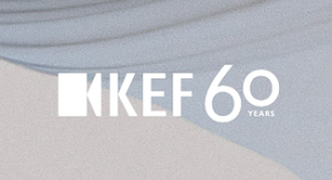
(2021) (60th Anniversary Logo)
The 60th anniversary logo of KEF featured the familiar speaker icon along with the initials “KEF”. The numerals “60” was placed to the right of the KEF logo where “6” appeared in a bigger size, while “0” a tad smaller and followed below by the words “YEARS”.
(2022 – Present)
The current logo shows the speaker emblem and the initials “KEF” in bold uppercase to its right in black.

The Elements of the KEF Logo
Font
The wordmark in the KEG logo is executed using a modern, clean, and bold sans-serif typeface to convey the brand’s focus on innovation, precision, and contemporary design. The uppercase letters of the wordmark are evenly spaced and convey a sense of balance.
Colour
The colour palette of the KEG logo is monochrome. Here, the colour black symbolises strength, professionalism, and timelessness, while the colour white offers the right contrast and visual clarity.
Finally
The KEF logo shows the growth of the brand by adhering to the qualities of innovation, precision, and timeless sophistication. In fact, each logo iteration of the brand is symbolic of growth and technological advancement. Besides, the use of bold, clean typography underscores KEF’s commitment to clarity and excellence, the qualities that define its sound engineering.