Kawasaki is a world-renowned Japanese motorcycle brand that forms a part of Kawasaki Heavy Industries. Founded in 1896, the brand carries a legacy that touches a vast range of sectors, from shipbuilding and aerospace to motorcycles and robotics. The Kawasaki logo is a powerful symbol that embodies more than a century of the company’s heritage in engineering and innovation.
Its visual evolution reflects both the company’s roots in heavy industry and its dynamic presence in the world of motorcycles and transportation. The article delves into the evolution of the Kawasaki logo, among other details of the company.
The Genesis of the Kawasaki Logo (1961 – 1967)
When Kawasaki ventured into motorcycles in 1961, it introduced its first distinct motorcycle logo. This design showed both a winding road and a motorcycle’s exhaust in black with slender white lines in parallel to symbolise speed and movement.
In the upper part of the design appeared the wordmark “Kawasaki” in white and written using a bold, all-caps sans-serif font. At the centre of the logo was shown a gold and white flag fluttering, a nod to the heritage of Kawasaki. This emblem emphasised Kawasaki’s entry into the motorcycle market while acknowledging its past.

(1967 – Present)
The 1967 logo iteration saw the logotype “Kawasaki” in black title case and rendered in a sans-serif typeface. This particular logo iteration exists to this day.

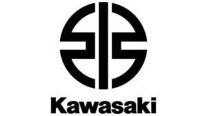
(1967 – 2021)
In 1967, Kawasaki unveiled another significant redesign that became iconic for decades. It introduced a bold sans-serif wordmark, often black or red. The red colour reinforced Japanese tradition and gave the logo both cultural and contemporary relevance. It featured a massive stylised capital “K” in scarlet to symbolise energy and precision. The design was simplified and professional, which marked Kawasaki as a modern, global manufacturer.

(2021 – Present)
In 2021, Kawasaki resurrected its historic ties by integrating the River Mark into its primary branding across all divisions. It featured a wavy logo with a vertical bar as a reference to the original shipyard flag. It was brought back to signify unity across Kawasaki Heavy Industries. The logo now blends historical symbolism (River Mark) with the strong Kawasaki typeface to represent both legacy and innovation.
The Elements of the Kawasaki Logo
Font
The “Kawasaki” wordmark that forms part of the logo is rendered using a traditional, clean, and bold sans-serif Helvetica typeface. And thanks to the streamlined and slightly rounded shape of the letters, the wordmark is clearly legible. The font has similarities to Sequel Sans Head Black by OGJ Type Design, Para Type, and Crique Grotesk Black by Stawix.
Colour
Both the abstract emblem and the wordmark are executed in the same black shade.
Finally
The evolution of the Kawasaki logo conveys restraint and continuity. The brand has consistently designed logos that celebrate its history, convey speed, precision, and power, and exude confidence and modernity through minimalism and strong fonts. This visual identity helps Kawasaki stand out in both the crowded motorcycle arena and the realm of heavy industry. It signals reliability, legacy, and innovation at a glance.