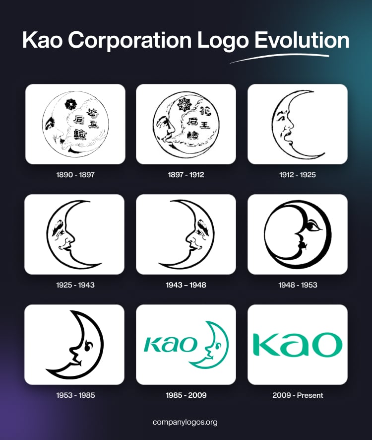
Kao Corporation is a leading Japanese consumer goods company that boasts a rich history dating back to its founding in 1887. The evolution of its logo reflects both changes in design trends as well as the company’s expanding global vision and enduring values of beauty and cleanliness. The article delves into the various logo iterations brought out by the company over the years.
The Genesis of the Kao Corporation Logo (1890 – 1897)
The first Kao logo was introduced in 1890 and was inspired by moon and star motifs found on imported pencils sold at Nagase Shoten, the shop that would become Kao. Founder Tomiro Nagase chose the moon as a symbol of beauty and cleanliness, for it aligned with the company’s mission to enrich people’s lives through quality products. The original logo featured the outline of the moon with several abstract elements inside, including a few Japanese letters.

(1897 – 1912)
The 1897 logo was a refinement of the original logo and distinctly featured a few elements inside the silhouette of a moon in black and white.

(1912 – 1925)
The logo of 1912 featured a crescent moon facing right in black and white. The moon literally had a human face that formed the contours of the moon.

(1925 – 1943)
The 1925 logo refined the previous logo with the visage of a human forming the contours of a crescent moon. Here, the contours were bold, thick, and easily identifiable.

(1943 – 1948)
Over the years, the logo underwent subtle changes. The moon’s face was reoriented to face left and represented the new moon as a symbol of growth and good luck in Japanese culture. The silhouette became rounder, with the top and bottom tips of the moon connected. This enhanced the logo’s friendly and approachable appearance.

(1948 – 1953)
In the logo iteration of 1948, the left-facing crescent moon with the visage of a human is turned into a full circle to form the shape of a heart. The contours yet again were drawn bold and thick.

(1953 – 1985)
Designed by Taiji Kawajiri, the 1953 logo variant showed the left-facing crescent moon and its contours turned into a clear visage of a human.

(1985 – 2009)
In 1985, the company’s name changed from Kao Soap Co., Ltd. to Kao Corporation. The logo’s colour was updated from black to green to symbolise freshness and dynamism. This era also saw the face on the moon become more friendly, and the overall design simplified for modern appeal. The left of the crescent moon motif saw the brand name “Kao” in a stylised custom typeface in green.

(2009 – Present)
To create a globally consistent corporate image, Kao introduced a new logo in 2009. The updated design did away with the crescent moon motif and featured the word “Kao” in the English alphabet to reflect the international reach of the company.

The Elements of the Kao Corporation Logo
Symbol
The logo often includes an arc or crescent motif, which represents an uninterrupted view of the horizon and symbolises global perspective and hope for the future.
Font
The Kao Corporation logo features the word “Kao” written in a stylised, modern sans-serif typeface. The font is characterised by its clean, rounded lines and geometric simplicity and contributes to a friendly and approachable appearance. This design choice reflects the company’s global identity and commitment to clarity and accessibility. In some applications, the full company name “Kao Corporation” appears in a more traditional serif font.
Colour
Green is the primary colour of the Kao Corporation logo, and it symbolises freshness, dynamism, and the company’s dedication to sustainability and innovation. The green colour is consistently used across all corporate branding and reinforces the values and identity of the company.
Finally
The various logo iterations of Kao Corporation are a testament to its enduring values and ability to adapt to changing times while maintaining a strong connection to its origins. The moon, which is a symbol of beauty and good fortune, continues to shine as a beacon of Kao’s brand philosophy.