JBL is an American company that produces sound devices, such as headphones, speakers, and acoustic systems. It was founded in 1946 by audio engineer and loudspeaker designer James Bullough Lansing. The company is known for producing and supplying high-fidelity loudspeakers and has made a mark for itself in cinemas, recording studios, and home audio enthusiasts.
The JBL logo has evolved from its early post-war origins to become one of the most recognisable symbols in professional and consumer audio. The various logo iterations are marked by bold design changes and a consistent emphasis on clarity and energy throughout its history. The article delves into the evolution of the JBL logo over the years, among other details of the company.
The Genesis of the JBL Logo (1946 – 1948)
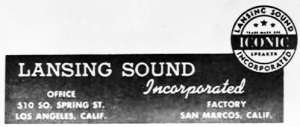
JBL was founded in 1946 by James B. Lansing after his departure from Altec Lansing, and the company was originally called “James B. Lansing Sound Incorporated”. The earliest logo reflected this full corporate name in white against a black background along with the office and factory addresses, respectively. A circular emblem with black outlines also did the rounds during this period. It featured the company name in uppercase along the edge. A wide horizontal band with the word “ICONIC” in white appeared at the centre.
(1948 – 1952)
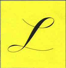
The 1948 logo iteration featured a stylish cursive letter “l” in black lowercase set against a vertically oriented rectangle in yellow with a thin black outline. The upper and lower parts of the letter were extended to the left and right, respectively. The letter “l” was a nod to the founder’s surname, “Lansing”.
(1948 – 1950)
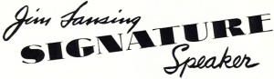
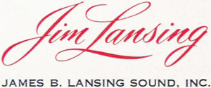
The 1948 logo featured the founder’s name, “Jim Lansing”, in a cursive handwritten script on the left, followed by the word “SIGNATURE” below. Written in thick uppercase glyphs with thin extensions, the word was placed at an angle and extended up to the extreme right. Below right was written the word “Speaker” in a cursive handwriting script. The lettering in black was contrasted against a white background.
(1950 – 1952)
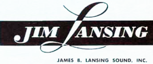
The 1950 logo variant saw the founder’s name written in italics uppercase. Written in white and set against a black rectangular background, the first letters of the name “J” and “L” were bigger than the rest. In fact, the letter “L” followed the style of the 1948 logo and was designed considerably bigger than the rest. Below the founder’s name appeared the full name of the company in black, but set against a white background.
(1952 – 1955)
The previous logo design elements were refined further. For instance, the founder’s name in red was handwritten in cursive lowercase. The full name of the company in uppercase was placed below.
(1955 – 1956)
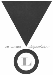
The 1955 logo featured a black inverted triangle followed by a circle below with a white core and thick black edges. Together, they formed the “exclamation mark” to convey the top-class sound quality of its products. To the right and left of the tip of the triangle were written the words “JIM LANSING” and “Signature”, respectively.
Here, the word “Signature” was rendered in grey cursive handwriting, while “JIM LANSING” was rendered in grey uppercase and using a sans-serif typeface. The letter “L” with sharp and thin serifs was placed at the centre of the circle.
(1956 – 1967)
Designed by Jerome Gould, the 1955 logo retained most of the elements of the previous logo. It featured the initials “JBL” in white against a circle with a thick white periphery and a black core. The circle was thought to be associated with the main product of the company, speakers.
Above the circle was present a large inverted triangle in white, which, together with the circle, represented an exclamation mark. The mark conveyed the brand’s confidence in the quality of its sound. To the right of the exclamation mark was mentioned the word “signature” in small letters but in a calligraphic style with flowing lines.

(1967 – 1988)
The now-iconic “red box” logo debuted in 1967, and it was designed by then-president Arnold Wolf. The logo featured custom white lettering “JBL” inside a solid red square. The letter “J” had a striking exclamation mark to emphasise clarity and excitement in sound. The font used to render “JBL” was a customised variation of News Gothic, which contributed to the logo’s strong visual identity.
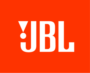
In another colour combination, the initials “JBL” were written in deep brown, while the exclamation mark was rendered in red.

(1988 – Present)
The 1988 logo iteration that continues to this day reduced graphic details for a sleeker, modern look. It sports a bright red square background and white-coloured lettering. JBL’s logo has appeared prominently on all its products. It has adapted in size and contrast to suit speakers, headphones, and digital interfaces.
The Elements of the JBL Logo
Font
The “JBL” inscription that forms part of the logo is written using a bold sans-serif typeface. The letters are characterised by sharp curves and straight angles. Further, the acute-angled triangle with a circle below forming a small exclamation mark sits perfectly before the letter “J” to balance its shape.
Colour
The colour palette of the logo design includes white and bright scarlet red for lettering and background, respectively. The colours convey a strong and confident look.
Finally
The history of the JBL logo variants illustrates the company’s dedication to audio excellence, innovation, and the creation of a clear, dynamic, and recognisable global brand identity. The evolution of the logo chronicles the growth of the company from a humble audio equipment manufacturer in its formative years to a world-class company known for its high-fidelity audio solutions.