ITV (Independent Television) is one of the leading television networks in the UK. It is known for its diverse programming and strong presence in British broadcasting. Launched in 1955 as a commercial alternative to the BBC, ITV was the first network in the UK to be funded by advertising revenue. Over the decades, it has grown to become a major player in the media landscape. It offered a wide range of content, including news, drama, entertainment, reality TV, and documentaries. ITV operates several channels, including ITV1, ITV2, ITV3, ITV4, and CITV, as well as a popular streaming platform, ITVX.
The ITV logo is one of the most recognisable symbols in British television, which reflects the network’s journey from a collection of regional broadcasters to a unified national brand. Its evolution shows changes in broadcasting technology, audience preferences, and ITV’s own corporate structure. The article delves into the various ITV logos and describes them, among other details about the company.
The Genesis of the ITV Logo (1955 – 1963)
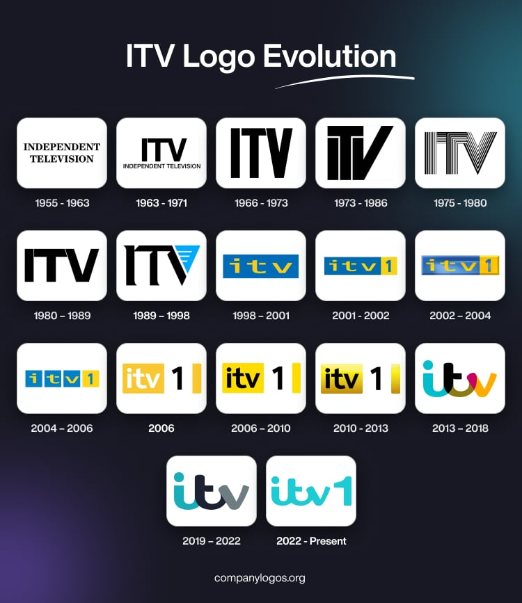
The first ITV logo was introduced in 1955, the year of the channel’s inception. The channel used to be called “Independent Television”, which was represented in its visual identity as well. The wordmark in the logo was black uppercase and displayed in two levels. It was rendered using a traditional serif typeface with bold lines.

(1963 – 1971)
The first logo change occurred in 1963 when the channel was renamed to ITV. It featured a large-sized monogram “ITV” using a minimalist and bold sans-serif typeface. In the monogram, the top bar of the letter “T” was connected to the top of the letter “V”. Also, beneath the monogram was written the tagline “Independent Television” in the same typeface, but in a scaled-down, lightweight version.

(1966 – 1973)
In the 1966 logo iteration, the large-sized monogram “ITV” appeared without the tagline below. Besides, the narrower and taller letters of the monogram were rendered using a bold and condensed sans-serif typeface. Unlike the previous iteration, the top bar of the letter “T” was not connected to “V”, but it carried a diagonal cut.

(1973 – 1986)
The 1973 logo variant saw the letters “I” and “V” positioned under the top bar of the letter “T”, which featured a diagonal cut. Besides, the right slanted bar of the letter “V” was elongated. The monogram was designed in black, similar to the earlier iteration.

(1975 – 1980)
The broadcasting channel saw a change in its logo in 1975 in the form of a striped monogram. Featuring a black and white striped pattern, the stripes had similarities when they repeated the contours of the letters in varying lines of thickness.

(1980 – 1989)
In 1980, ITV introduced a generic, blocky logo using a simple sans-serif typeface. This logo remained in use throughout the eighties, as well as on the logos of ITV Schools and ITV Telethon.

(1989 – 1998)
On 1 September 1989, ITV made its first concerted effort to establish a national identity. A new logo, designed by English Markell Pockett, was introduced as the centrepiece of a branding package. It featured the blocky black ITV monogram using a custom serif typeface where the letters had curved and pointed tails. Besides, the connection of these tails to the bars had a triangular connection. Interestingly, the right bar of the letter “V” was replaced by a light blue vertical triangle having three short horizontal lines in white to the left.

(1998 – 2001)
A significant rebranding effort in 1998 saw the ITV logo switch to a lowercase “itv” in yellow against a horizontally oriented rectangular background in blue. Aiming for a friendlier and more youthful appeal, the ITV monogram in lowercase had distinct and disjointed lettering for “i” and “t”.

(2001 – 2002)
ITV was renamed ITV 1 in 2001, and it lasted till 2013. Consequent to the change of name, the previous logo iteration was complemented by the blue numeral “1” against a yellow square background. Designed by English & Pockett, the wordmark “itv” in lowercase was written using the OCR-B typeface, while the numeral “1” was written using the Frutiger Bold typeface.

(2002 – 2004)
Designed by Bruce Dunlop and Associates, the logo iteration of 2002 was made three-dimensional in its appearance. The logo received gradient shades in blue and yellow with slightly extended lettering.

(2004 – 2006)
With the launch of ITV3 in November 2004, the ITV1 logo was redesigned into three separate blue squares and a yellow square. Each letter of the monogram in yellow lowercase was placed on a blue square, while the numeral “1” in blue was placed on a separate yellow square.

(2006)
Designed by Red Bee Media, the new logo iteration of 2006 featured a yellow-white-black colour palette. Here, the white “itv” monogram written using a modern sans-serif typeface was placed on a yellow background. At the same time, the numeral “1” in black was placed on a white square.

(2006 – 2010)
In 2006, the previous logo reiteration was refined by changing the colour of the “itv 1” monogram to black. However, the background colour of yellow remained the same. It was designed by Blink Productions, Pleix, The Mill, and ITV Creative.

(2010 – 2013)
Designed by ITV Creative, Blink Productions, and Pleix, the logo of 2010 was made three-dimensional by adding dark gradient shades, especially to the bottom part of the logo. However, the colour palette and typeface remained the same.

(2013 – 2018)
On 14 January 2013, ITV underwent a major rebrand, wherein it dropped the numeral “1” and returned to simply “ITV”. The new logo was designed by Rudd Studio and was inspired by handwriting to convey friendliness and approachability. A unique feature of the logo was “colour picking”, wherein the logo segments changed colour to match the background.
The “itv” monogram was written using a bold custom typeface where the three letters overlapped each other. Besides, each letter displayed a separate colour, including the “overlapping areas”. The colour palette comprised dark green, turquoise, and yellow.

(2019 – 2022)
Designed by DBLG, the 2019 logo variant was simplified by doing away with the “overlapping areas”. The monogram was drawn using three colours only – solid turquoise, black, and grey.

(2022 – Present)
The latest logo was launched on 15 November 2022 and designed by ITV Creative, DixonBaxi, and F37. It featured the monogram “itv” along with the numeral “1” as the channel was rebranded from ITV plc to ITV1. In the logo, the numeral “1” in turquoise colour was drawn bigger than the “itv” monogram, also in turquoise.

The Elements of the ITV Logo
Font
The wordmark for the ITV logo is written in lowercase letters with a custom rounded sans-serif typeface. The custom font used in the logo is similar to F37 Zagma.
Colour
The basic version of the ITV logo comprises a discreet colour palette, namely, solid turquoise, black-blue, and grey.
Finally
The ITV logo and its various iterations show the transformation of the network from a loose federation of regional broadcasters to a unified, modern media brand. Each logo redesign highlights the shifts in audience expectations, technological advances, and ITV’s own strategic goals. It demonstrates the enduring importance of visual identity in broadcasting.