Intuit Inc. is a leading global financial technology company that develops software solutions to simplify personal finance, small business accounting, and tax management. It came into being in 1983 and is based in Mountain View, California. Intuit has become a trusted name in digital finance through its innovative products such as QuickBooks, TurboTax, Credit Karma, and Mailchimp.
Over the years, the company has transformed traditional, paper-based financial tasks into intuitive and automated digital experiences. It thus empowered individuals, entrepreneurs, and accountants to manage money more efficiently. It has a strong focus on artificial intelligence, automation, and user-centric design and continues to shape the future of financial accessibility. It helps millions of users to make confident financial decisions in an increasingly digital world. The article explores the various logo changes of Intuit, among other details of the company.
The Genesis of the Intuit Logo (1983 – 2008)
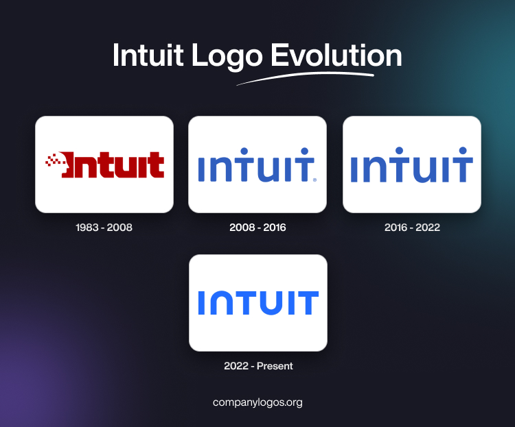
The original Intuit logo featured the brand name with the silhouette of a person’s head visible in its left side view. The person’s head featured multiple red squares to represent the thought process that often leads to intuitive breakthroughs. The brand name is written using a bold and massive typeface with sharp angles.
The letters of the wordmark appear as monolithic, while the red pixel squares appearing in the head seem to dissolve into thin air. The pixelated square elements and the monolithic geometric shapes of the letters convey the idea of technological precision.

(2008 – 2016)
The redesign of 2008 was done by the design firm Lippincott. It was much simpler, as it featured just the brand name in blue. Here, although the silhouette of the human face was missing, two dots appeared above the letters “T”. These looked like silhouettes of people with stretched arms. Besides, the letters of the logo were in mixed cases – “I” and “T” in uppercase, while “u” and “n” were depicted in lowercase.

(2016 – 2022)
In 2016, certain tweaks were made to the previous iteration. For instance, the colour became a little darker. Also, the letter ends have got square angles instead of the rounded ones earlier.

(2022 – Present)
In the current logo iteration, the dots over the letter “T” were removed. The letterforms became more dynamic and easier to read. The dark blue colour in the previous logo was changed into a lighter and brighter shade. Besides, the shapes of the letters “N” and “U” mirror each other.

The Elements of the Intuit Logo
Font
The wordmark representing the Intuit logo is based on a design that has been conceptualised by in-house designers in collaboration with a San Francisco-based studio, Moniker SF. The typeface used is clean and modern and a custom variant of Avenir Next. Also, the font closely resembles IDroit Regular and is characterised by the distinct letter “N” that looks like an inverted “U”.
Colour
The Intuit logo is designed using the colour blue, which signifies trust and stability.
Finally
The Intuit logo and its various iterations show how the company transformed itself from a software startup to a global leader in financial technology. The logo stands as a symbol of trust, innovation, and financial empowerment. It represents a continuously evolving platform that is dedicated to helping individuals and businesses thrive in an increasingly digital financial world.