Intel is one of the world’s most influential technology companies that was founded in 1968. Based in the USA, the company produces an array of technological products that have revolutionised the world of computers. These include microprocessors, graphic processors, network cards, chipsets, and others. Intel has maintained a strong and evolving visual identity since its founding. It changed over time, and each change reflects shifts in the tech landscape and Intel’s ambitions. The article delves into the history and evolution of the Intel logo, among other details.
The Genesis of the Intel Logo (1969 – 1991)
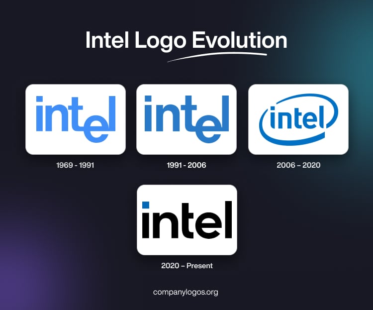
When Intel was founded by Robert Noyce and Gordon Moore, the original logo was designed to embody both simplicity and innovation. This logo, trademarked on March 11, 1969, featured a clear, modified Helvetica bold, sans-serif font with a distinctive twist: the letter “e” was dropped below the baseline. This created a visual cue that conveyed the company’s willingness to break conventions and think differently. The logo was rendered in a light blue colour, a choice that would become a hallmark of the brand. It symbolised trustworthiness and technological prowess.

(1991 – 2006)
In the 1991 logo edition, the original logo design was retained, but the colour shade was changed to a darker one. During this time, Intel also launched the “Intel Inside” campaign. This move was part of a strategic marketing effort to make consumers aware of the value of Intel processors in their computers.

(2006 – 2020)
In 2005, Intel underwent a significant rebrand to modernise its image and align with its expanding portfolio. The new logo, which was designed with the help of FutureBrand, drew inspiration from the successful “Intel Inside” campaign. Accordingly, the wordmark was updated, the letter “e” was brought in line with the other letters, and the entire word was encircled by a sleek, elliptical swoosh. This design symbolised movement, dynamism, and Intel’s forward-looking vision.
The blue palette was retained to ensure continuity and trust, while the new tagline “Leap Ahead” was introduced to signal Intel’s commitment to innovation and leadership in technology. This era also saw the introduction of a more geometric, slightly squared font called ‘Neo Sans Intel to emphasise modernity and precision.

(2020 – Present)
In 2020, Intel unveiled its most significant redesign in over a decade. This new design by Andrew Mirakian of VMY&R reflects the evolution of the company into a broader technology leader. The new logo stripped away the swoosh and embraced a minimalist, geometric wordmark in black and blue. The typeface used to write the brand name was a custom sans-serif one called Intel One. It was designed to reflect modernity, clarity, and approachability. Also, the dot over the letter “i” is now a square. It was redrawn to symbolise the microchips at the heart of Intel’s business and represents the potential and power of Intel processors.

The Elements of the Intel Logo
Font
The wordmark used in the Intel logo is written using a custom sans-serif typeface. The letter “i” has a square on its top, instead of the conventional round dot. Besides, the horizontal bar of the letter “t” is smaller.
Colour
The Intel logo uses a light blue shade for the square placed above the letter “i.”. For the rest of the letters, black is used as the primary colour against a white background.
Finally
The Intel logo and its various iterations are a testament to the company’s ability to adapt and lead in a rapidly changing industry. It began with the rebellious “dropped-e” to the sleek swoosh and now the minimalist, geometric design. Each logo iteration has captured the spirit of its era while maintaining the core values of innovation, reliability, and forward-thinking.