Infineon Technologies AG is a leading global semiconductor company that develops innovative, energy-efficient, and qualitatively superior electronic solutions for a wide range of industries. Based in Neubiberg, Munich, Bavaria, Germany, Infineon is known for technologies used in a slew of industries. These include automotive systems, power electronics, industrial automation, IoT devices, telecommunications, and security applications.
The company is especially known to have contributed to the electric vehicle market, smart mobility, renewable energy systems, and cyber security solutions. The Infineon logo did not change much over the years, and its design combines the dot and the swoosh. The article delves into the evolution of the Infineon Technologies AG logo, among other details of the company.
The Genesis of the Infineon Technologies Logo (1999 – 2005)
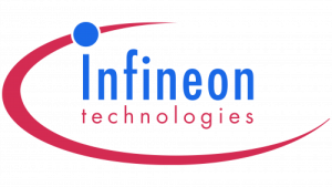
The original Infineon Technologies logo was designed using a text-based name and a graphic emblem. The brand name was at the centre of the logo in lowercase letters and in two levels. The top and bigger word “Infineon” was depicted in a deep blue shade, while the bottom “technologies” was depicted in a smaller size in red. It was written using a simple typeface consisting of little rounded letterforms. The first letter “i” had a large dot connected to the stretched red arc around it.
(2005 – Present)
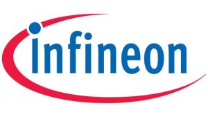
The current logo was introduced in 2005, and it made subtle changes to the original logo. For instance, the word “technologies” was removed, and the logotype remained “Infineon” only in a bright cobalt blue colour shade. The typeface used in the logotype is similar to the commercial FF Meta Std Condensed Bold. The arc appears closer to the wordmark and encircles almost the whole wordmark.
The Elements of the Infineon Technologies Logo
Font
The wordmark used in the Infineon logo uses a simple typeface that is similar to the commercial FF Meta Std Condensed Bold typeface. The letters of the wordmark are elongated and slightly rounded. Also, the first letter of the wordmark “i” has a large dot that is directly connected to the graphic element of the logo.
Colour
The Infineon Technologies logo is designed using a bright cobalt blue colour to depict the wordmark and a red stretched arc around it.
Finally
The Infineon Technologies logo has remained more or less the same, with only a rejig in 2005. The logo reflects the journey of the company from a spin-off of Siemens to a globally recognised semiconductor leader. The sleek typography and refined graphical emblem convey trust, high-tech expertise, and engineering precision.