iFlytek is a leading Chinese technology company that specialises in artificial intelligence, particularly in the fields of speech recognition, natural language processing, and intelligent voice interaction. Based in Hefei, Anhui Province, China, the company was set up in 1999 and has since grown into one of China’s most influential AI innovators.
It is often regarded as the forerunner in commercialising voice-driven technologies. iFlytek’s platforms power a wide range of applications, such as smart assistants, education tools, translation devices, enterprise solutions, and government services. It thus allows its technology to be deeply integrated into everyday digital experiences across China.
iFlytek puts a strong emphasis on research and development and continues to push the boundaries of human-machine interaction. It aims to create seamless communication between people and devices. It envisions building an AI ecosystem that enhances productivity, accessibility, and learning through intelligent voice and language technologies. It appears the iFlytek logo did not change much since the founding of the company. The article explores the two logos introduced by the company since its establishment, among other details.
The Genesis of the iFlytek Logo (1999 – 2008)
The original logo image is not available in public archives. However, it most likely displayed the brand name in both Chinese and English in a clean, bold, and blockier sans-serif typeface in blue to emphasise academic and technological reliability.
The brand name is stylised in uppercase letters “FLYTEK” with the exception of the first letter “i” in lowercase. Here, the “i” prefix subtly evoked the idea of intelligence. A graphical emblem forming the letter “X” using two swinging arcs and three left tilted lines appeared on the left of the wordmark.
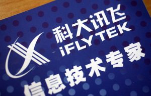
(2008 – Present)
The current logo retains the earlier design but depicts the brand name in a refined sans-serif typeface. It has been optimised for apps, websites, and AR/VR. The letterforms of the wordmark have thinner stroke weights and are lighter and more elegant for high-resolution screens.
The graphical emblem in blue is an integration of a pair of sweeping arcs intersecting each other and three left tilted lines to form an abstract letter “X”. Here, the arcs represent human-machine interaction or the information flow between people and AI systems. It is depicted along with a “iFLYTEK” text in blue.

The Elements of the iFlytek Logo
Symbol
The “”X”-shaped graphical emblem is seen as a pair of sweeping arcs intersecting each other and forming the letter with three left tilted lines. The arcs represent human-machine interaction or the information flow between people and AI systems. Besides, “X” also symbolised motion and technological fluidity.
Font
The brand name in the logo is written using a clean, rounded, and modern sans-serif typeface in a mix of lowercase “i” and uppercase “FLYTEK”. The Chinese name, on the other hand, appears in a bold and geometric Chinese script above the English lettering.
Colour
The iFlytek logo is depicted in a deep, technological blue to symbolise trust, reliability, professionalism, stability, and advanced digital intelligence.
Finally
The iFlytek visual identity in the form of its logo shows how the company grew from a startup that dealt in speech technology to a global leader in cutting-edge technologies, such as artificial intelligence. The two logos are consistent with the expanding vision of iFlytek, which is to become the creator of an AI ecosystem. The refined and modern logo symbolises the brand as well as a commitment to advancing human–machine interaction and shaping the future of intelligent technology.