The Industrial and Commercial Bank of China (ICBC) is arguably the largest bank in the world when it comes to market capitalisation and total assets held. This state-owned banking behemoth provides a range of services, such as investment banking, corporate and retail banking, and asset management. The bank plays an important role in the economic development of the country by financing major infrastructure projects, facilitating global trade and investments, and supporting companies of various sizes.
The logo of the Industrial and Commercial Bank of China (ICBC) has a rich history, and its symbolic evolution is closely tied to the bank’s origins and identity as a major financial institution in China. The article explores the evolution of the ICBC logo over the years.
The Genesis of the ICBC Logo (Before 2006)
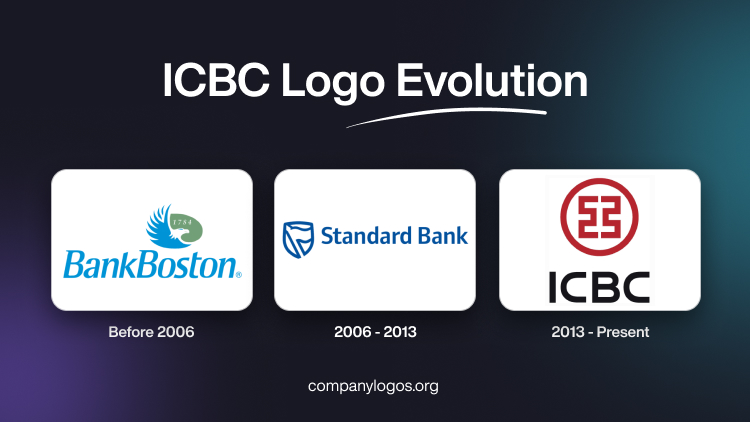
The first logo of the ICBC bank was created for BankBoston, its erstwhile name. It featured a horizontally oriented oval emblem formed out of a flying eagle in blue and white on a green background. There was the date “1784” written on the green background in white. Below the emblem was written the bank name “BankBoston” in sky-blue italics and using a narrowed sans-serif typeface.

(2006 – 2013)
In 2006, the logo featured the wordmark “Standard Bank” to portray the new name of BankBoston in blue title case and using a modern and elegant sans-serif typeface. To the left of the wordmark appeared the emblem comprising a blue contoured crest with a waving flag inside.

(2013 – Present)
The ICBC logo comprises a circular emblem containing a crimson seal, which is a traditional Chinese symbol of authenticity and trust. Below it is mentioned the ICBC wordmark in a bold black sans-serif typeface in uppercase.

The Elements of the ICBC Logo
Font
The ICBC (Industrial and Commercial Bank of China) logo uses a bold, uppercase modern sans-serif typeface for the “ICBC” wordmark. The typeface is designed to be solid and strong to reflect the stability and authority of the bank. The Chinese characters below the “ICBC” text are also rendered in a simple, legible style for consistency and clarity.
Colour
The primary colour scheme of the ICBC logo is red and black. The logo features a prominent red circular emblem at the top. Here, red symbolises prosperity and good fortune and aligns with traditional Chinese values. Further, the “ICBC” text and accompanying Chinese characters are in black. The black colour provides a strong contrast against the red emblem and ensures high visibility and legibility.
Finally
The ICBC logo encapsulates the bank’s mission and values. It also reflects its origins, growth, and aspirations as a leading global financial institution with strong Chinese characteristics.