Husqvarna is arguably one of the oldest operating companies in the world, which came into existence in 1689 in Sweden. Initially, the company used to produce muskets for the Swedish Army but is now reputed as the producer of several types of lawnmowers, garden tools, small tractors, chainsaws, cultivators, and motorcycles.
The story of the Husqvarna logo begins in 1689; it was founded in Huskvarna, Sweden, as a royal arms factory. This heritage has directly inspired the brand’s iconic logo, which to this day represents a stylised gun sight viewed from the end of a barrel. The logo iterations showcase the company’s remarkable multi-sectoral journey as a manufacturer. The article explores the various changes undertaken by the Husqvarna logo, among other details of the company.
The Genesis of the Husqvarna Logo (1689 – ????)
The company was established in 1689 to produce muskets. So, the logo too featured a circle with a crown above it to showcase its role in serving as a Royal Arms Factory. The logo encapsulated the muzzle of a musket, a bullet protecting the throne, and the royal ring, which acted as permission by the king. It appeared like a rounded seal with three protruding lines to symbolise a crown.

(1912 – 1973)
The 1912 logo iteration featured an emblem and the wordmark in a title case and in an extra-bold serif typeface. The emblem constituted a circle with a crown atop it. The circle had a monogram inside with a gothic-style appearance that symbolised the legacy of the company.

(1973 – Present)
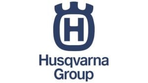
In 1973, the logo was modernised by adopting a blue, stylised crown with an “H” at the centre. The word “Husqvarna” appeared beneath or to the right of the emblem in a crisp, title-case sans-serif font. This version paid homage to the original 1689 brand while bringing a sleeker and more contemporary look. The blue-and-white palette conveyed reliability, trust, and professionalism.

(2012 – Present)
In the current logo iteration, the colours changed to a slightly darker blue. The wordmark too was changed to “Husqvarna Group” and presented across two lines under the crown. This enhanced the sense of modernity and sophistication and signalled the global ambitions of the company.
The Elements of the Husqvarna Logo
Font
The current logotype uses a bold, clear sans-serif typeface, which is similar to Sequel Sans or Shapiro Max Heavy. This gives off a sense of strength and dependability.
Colour
Deep blue and white are used for most Husqvarna products to convey protection and reliability. Some divisions, like outdoor power tools, have embraced vibrant oranges and greys. Here, orange signifies energy and innovation, while grey signifies stability and wisdom.
Finally
The Husqvarna logo iterations weave together three centuries of history by honouring its origins in firearm production. The logos also show its adaptation to a future focused on innovation and global brand identity. Thus, what began as a simple mark on a musket is now a globally recognised emblem. It embodies craftsmanship, quality, and a rich Swedish legacy.