Hoya Corporation is a global medical technology company from Japan. It is renowned for delivering innovative high-tech and medical products across the healthcare and information technology sectors. It was established in 1941 as a manufacturer of optical glass and has since evolved into a leading supplier of eyeglass lenses, contact lenses, medical endoscopes, intraocular lenses, and diagnostic imaging systems. At the same time, it also provides advanced components for semiconductor devices, LCD panels, and hard disc drives.
The Hoya Corporation logo reflects the company’s roots in precision optics and its expansion into diversified technology. The logo showcases the transformation of Hoya Corporation from a local glassworks to a global technology leader. The article explores the logo evolution of the company, among other details.
The Genesis of the Hoya Corporation Logo (1941 – 1959) (Unavailable)
Although Hoya Corporation was established in 1941, there is no documented evidence of a formal modern logo in this period. It can be assumed that the logo during that period likely featured a simple logotype.
(1960)
A major milestone in Hoya’s brand history occurred in 1960, when several group companies were merged to form Hoya Crystal. This transition was accompanied by the introduction of a new corporate logo and was aligned with the company’s new slogan, “Exploring the functional possibilities of glass.” The logotype in blue featured the brand name “HOYA” in geometric uppercase with each letter stretched vertically. The letter “Y” looked more like a tuning fork, while the crossbars of the letters “H” and “A” appeared quite low. Furthermore, the letter “A” had a rounded top rather than a pointed one.
(1984 – 2015) (Unavailable)
In 1984, the company was officially renamed Hoya Corporation. However, there is no documented proof of the logo change that took place during the period. It can be assumed the logo is text-based, like its predecessor, but with better conveyed clarity and vision across industries.
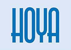
(2015 – Present)
The current logo appeared circa 2015 and continues to this day. It features a modern “HOYA” wordmark in blue, which is written using a clear, modern, geometric sans-serif typeface. Interestingly, the crossbar in the letter “H” with pointed ends on either side spills into the letter “O”.

The Elements of the Hoya Corporation Logo
Font
The font is a custom, modern sans serif, conveying a sense of precision fitting for a company specialising in optics and technology.
Colour
The primary brand colour is a distinct blue, often associated with trust, vision, and transparency, and featured prominently in Hoya’s logo and corporate materials.
Finally
The logo of Hoya Corporation has evolved from simple, functional signage to a modern, globally recognised wordmark. This evolution reflects changes in visual design as well as the company’s enduring commitment to clarity, technology, and innovative progress in optics.