Hot Wheels is a US-based toy car maker that produces miniature replica cars. Belonging to the Mattel company, the cars produced by Hot Wheels are quite popular with both adults and children. Since its launch in 1968, Hot Wheels has become a global icon in the toy industry and is recognised for its bold and dynamic branding.
At the core of its identity is the instantly recognisable Hot Wheels logo. It is a flaming emblem that has evolved over the decades while maintaining its core spirit of speed, excitement, and fun. This article explores the history, design evolution, and symbolism of the Hot Wheels logo, among other details of the company.
The Genesis of the Hot Wheels Logo (1968 – 1969)
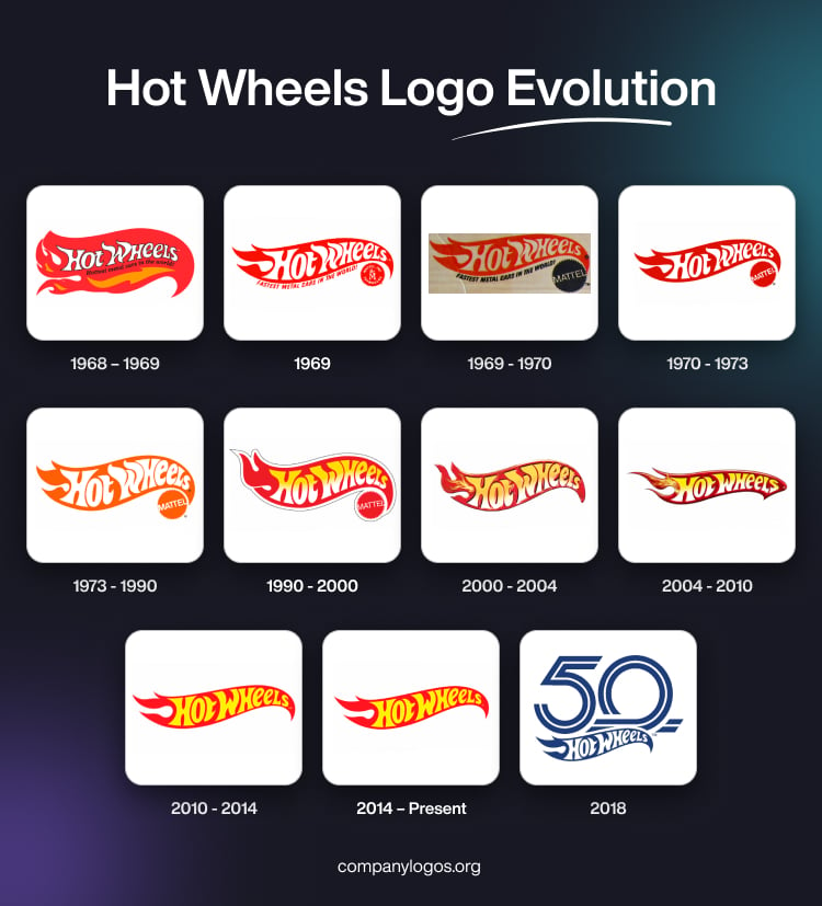
The first Hot Wheels logo was introduced in 1968 and was designed by Otto Kuhni, who was a graphic designer at Mattel. The logo featured a vibrant fire symbol in red, orange, white, and black. Besides, it housed the brand name (in white with a black outline) and the slogan, “Hottest metal cars in the world” (in black).
The design aimed to evoke the energy of fire and speed, and it aligned with the brand’s hot rod inspiration and the excitement of miniature racing cars. The font used to render the wordmark was a custom, bold, italic, sans-serif typeface, which was clean and readable and suitable for both children and adults.

(1969)
In the first logo update, the orange elements of the “fire” were removed, and the logo was simplified. The number of “flares” at the back of the logo was reduced to three from the seven in the original. The size of the white letters forming the brand name was increased to make the brand name more legible. The black outline around the white letters forming the brand name was removed.
The glyphs attached to the letters were redrawn, although care was taken to retain their fiery style. The old tagline was changed to “Fastest metal cars in the world!” and was moved out of the flame. Lastly, the circular logo of the parent company “Mattel” in red and white with continuous jagged edges was added to the lower right corner as well.

(1969 – 1970)
In another update the same year, the previous iteration was more or less retained. However, the colour of the tagline below the fiery emblem was changed to black. The circular Mattel logo in the lower right corner appeared with a black background, while the wordmark “MATTEL” in the foreground was rendered in white.

(1970 – 1973)
The 1970 update further streamlined the design, wherein it eliminated the tagline altogether. Besides, the circular Mattel logo at the lower right corner was rendered in black and white. The overall colour of the Hot Wheels logo became a richer, darker red, and the look was modernised for clarity and impact.

(1973 – 1990)
In 1973, the flaming emblem and the Mattel logo adopted a burnt orange flame background, and the brand name appeared in a larger and more prominent white wordmark. This version proved highly successful and remained in use for nearly two decades.

(1990 – 2000)
The 1990s brought a more dynamic look to the logo. Here, the flaming emblem returned to a red colour, while the wordmark appeared in a combination of yellow and white. Also, the logo gained a black and white outline, which gave it a three-dimensional effect.

(2000 – 2004)
In the 2000 logo iteration, the black outline and the Mattel logo to the lower right corner of the flaming emblem were removed. Additionally, a yellow-orange flame was added to the left of the letter “H” of the brand name. The white gradient on the wordmark turned soft. The colours of the logo became darker, and the design was further simplified for a modern audience.

(2004 – 2010)
The 2004 logo appeared sleeker, with darker colours and a more streamlined wordmark. The top of the flame became sharper and more pointed, emphasising speed and motion.

(2010 – 2014)
The 2010 logo returned to a flat design and did away with the 3D effect. It featured a red flame background and a bright yellow wordmark to create a bold, eye-catching look.

(2014 – Present)
The 2014 update retained the style of the previous design but reduced the overall size for versatility across media. The current logo uses two main colours, that is, red for speed and yellow for fun. This was to maintain the playful and energetic identity of the brand.

(2018)
In 2018, Hot Wheels celebrated its 50th anniversary with a special logo. It featured the iconic flame emblem beneath a stylised “50”, rendered in blue and white. This commemorative emblem appeared on packaging and promotional materials and marked a milestone in the brand’s history.

The Elements of the Hot Wheels Logo
Font
The wordmark used in the Hot Wheels logo uses a custom typeface with an uneven and asymmetrical shape of the letters inspired by the fire. The typeface used in the logo is similar to the Heavy Heap from Typodermic fonts.
Colour
The logo uses a colour palette that contains red, yellow, and orange to depict what can be called “fiery” colours.
Finally
The Hot Wheels logo stands as a testament to enduring brand identity in the toy industry. Its evolution reflects changing design trends while staying true to the brand’s core values of speed, fun, and imagination. The flaming emblem remains a beloved symbol for generations of fans. It captures the spirit of play and the thrill of racing in a single, unforgettable image.