Hitachi, Ltd. is a globally recognised Japanese multinational conglomerate based in Tokyo, Japan. It was founded in 1910 by engineer Namihei Odaira and has since grown from a small electrical repair shop into one of the world’s leading providers of infrastructure, technology, and industrial solutions. Its diverse portfolio spans information technology, energy, rail systems, construction machinery, healthcare, and smart infrastructure.
The evolution of the Hitachi logo reflects the company’s journey from its early Japanese industrial roots to a unified, digital-first global brand. The article delves into the various changes made to the Hitachi logo since the inception of the company, among other details.
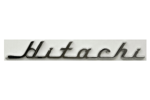
The Genesis of the Hitachi Logo (1910 – 1918)
The original logo was created by founder Namihei Odaira. It featured the brand name written by hand in black and was inclined to the left. The leg of the first letter “H” was extended to the left and turned into a thin line to underscore the brand name. The cursive letters were interconnected.

(1918 – 1968)
The 1918 logo also showcased the brand name handwritten in italics with a right tilt of letters. The underline of the previous logo was done away with but was replaced with the base of the letter-to-letter connections.
(1968 – 1992)
Designed by Namihei Odaira, the 1968 logo consisted of an emblem and the brand name. The intricate emblem resembled an eye and was formed by multiple elements. The wordmark, on the other hand, is written using a minimalist sans-serif typeface in uppercase.

(1992 – Present)
The 1992 logo, which holds till today, is devoid of any emblem. It features the brand name in either red or black in uppercase and set against a white background.

Apart from the brand name, the logo also sports the tagline “Inspire the Next” in grey, but with a red accent above the letter “t”.


The Elements of the Hitachi Logo
Font
The sans-serif typeface used to write the logotype of Hitachi is similar to the Helvetica 73 Bold Extended and the Univers Bold typefaces.
Colour
The wordmark “HITACHI” in uppercase is depicted in red or black against a white background.
Finally
The evolution of the Hitachi logo reflects the journey of the company from its humble beginnings as a small electrical workshop in 1910 to its status as a global leader in technology and innovation. The clean typography and consistent use of the Hitachi wordmark emphasise clarity, reliability, and trust. The logo represents a global conglomerate as well as symbolises Hitachi’s “Inspire the Next” philosophy.